
Outdoor Adventure Brand Identity Design
Built for the Wild. Designed to Stand Out.
Feral Atlas is a conceptual outdoor lifestyle brand inspired by the people who would rather take the trail less traveled. The creative challenge was to develop an identity that felt rugged and adventurous without looking like every other outdoor gear company on the shelf.

Scope of Work
Brand Identity Design • Logo Design • Custom Typography • Creative Direction • Merchandise Design • Marketing Collateral
The Creative Challenge
Outdoor brands have a familiar visual language: mountains, trees, earthy colors, and a whole lot of rugged typography. The challenge was to work within that world without creating something predictable.
Feral Atlas needed a recognizable identity with enough personality to live on apparel, gear, packaging, and marketing materials. Something that could make an impression on a storefront poster and still hold its own as a small mark on a product.
The Design Direction
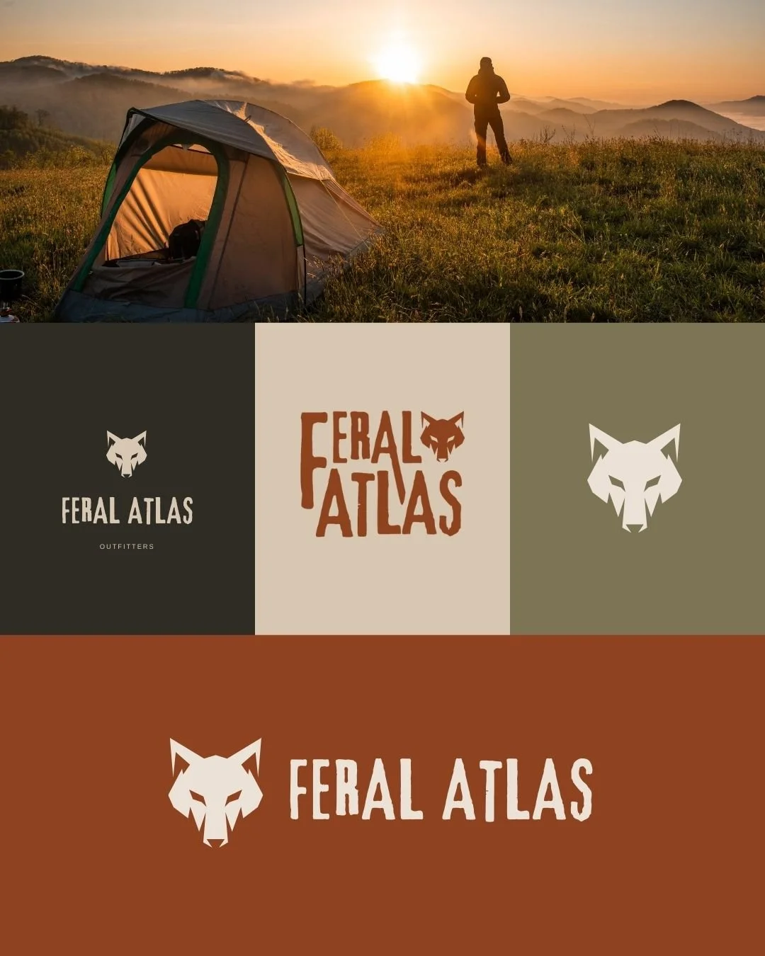
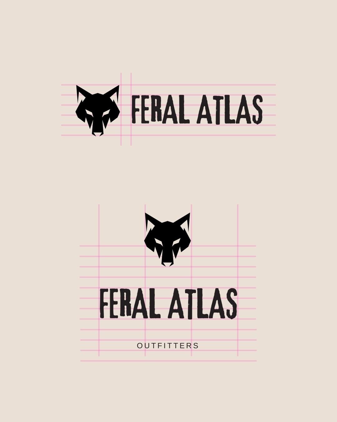
The wolf became the defining element of the identity, representing independence, resilience, and the instinct to explore.
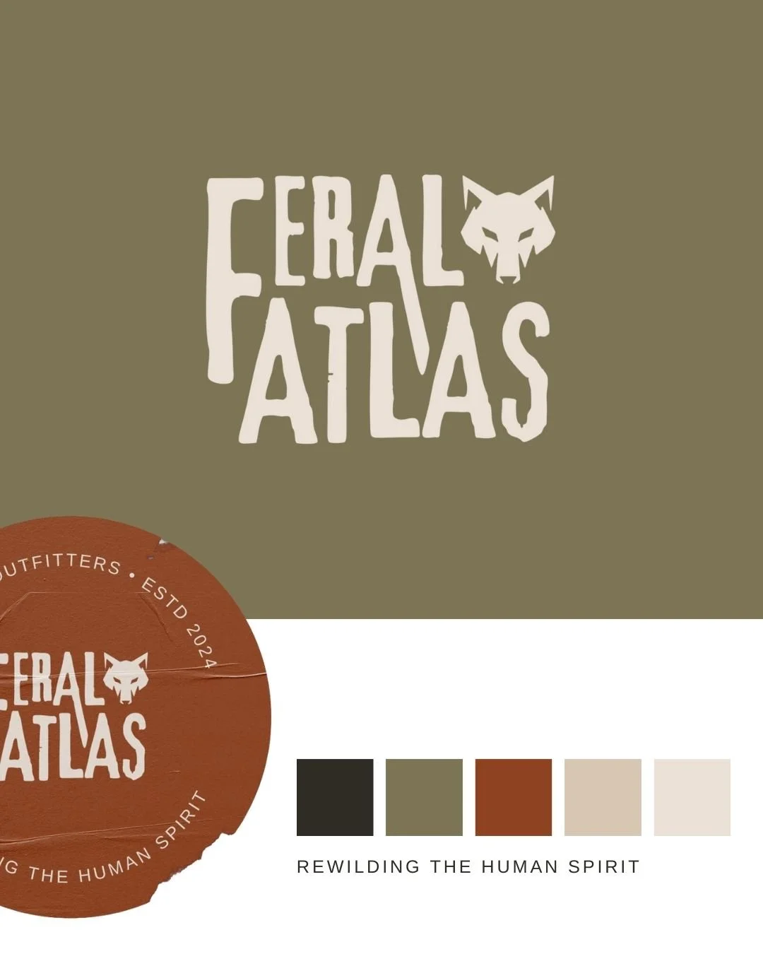
We paired it with bold, hand-drawn lettering that feels intentionally imperfect. The typography carries the same untamed energy as the name, while the restrained palette of rust, olive, charcoal, and warm neutrals gives the brand an earthy foundation.
The result is a visual language that feels at home outdoors without relying on the usual mountain-and-pine-tree clichés.
Made to Go Places
A brand identity has to work beyond the logo file.
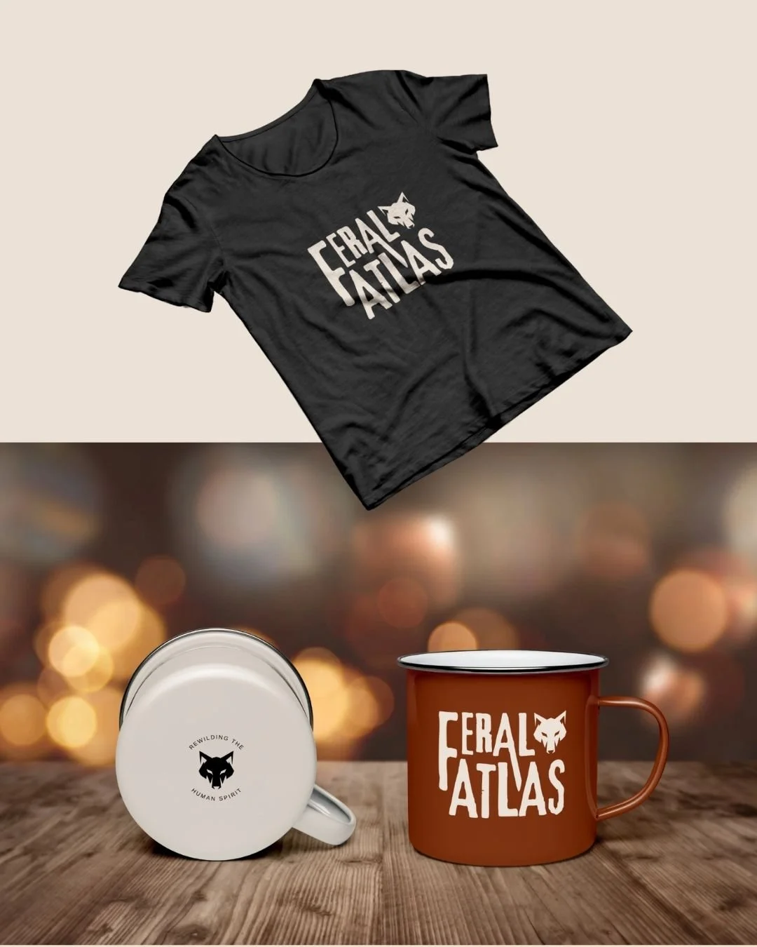
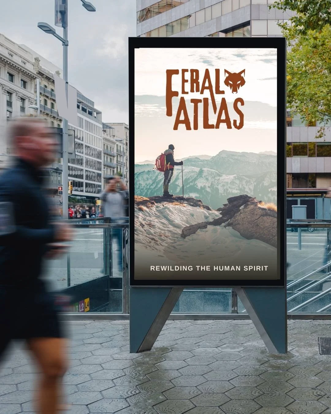
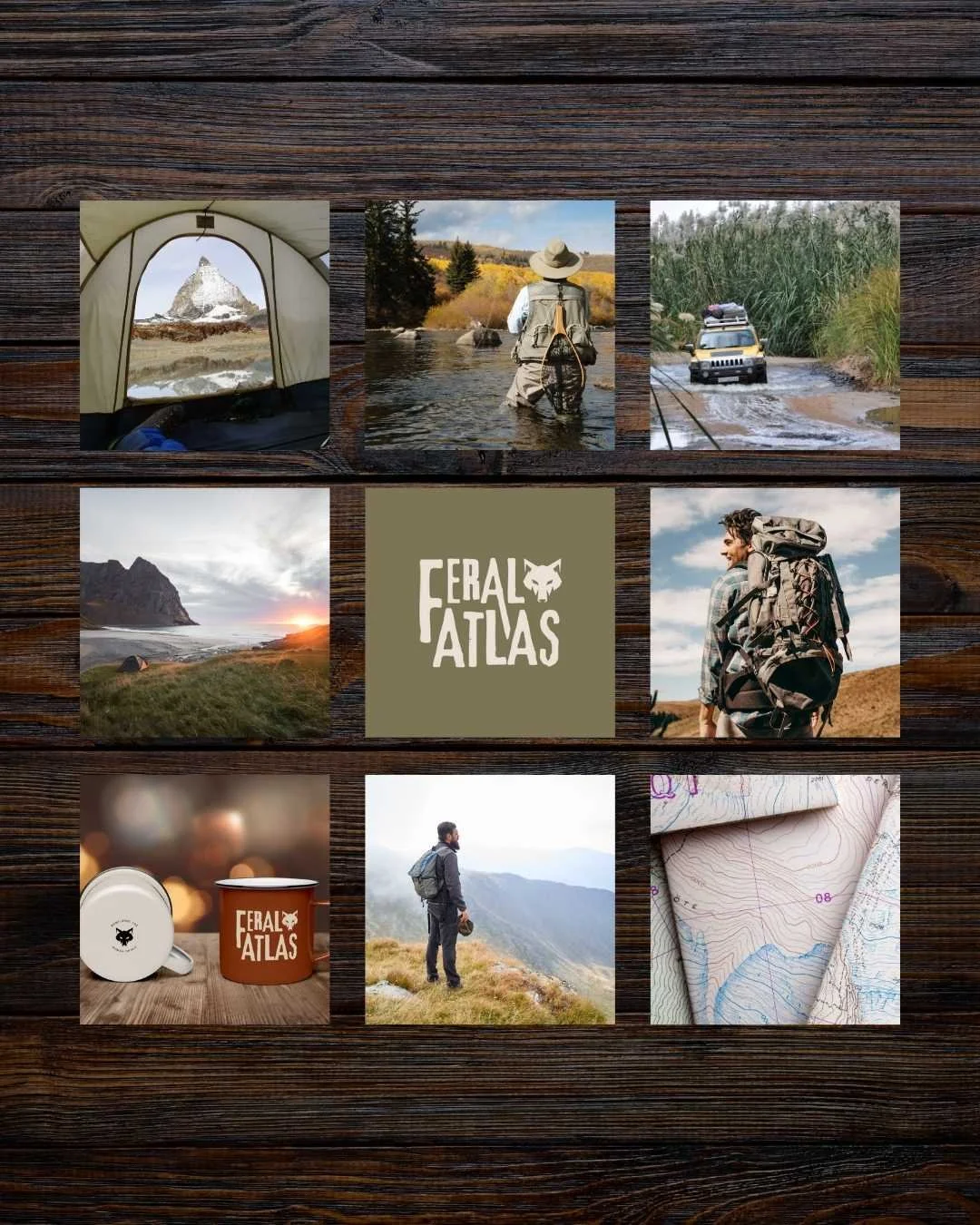
We explored how Feral Atlas could show up across apparel, drinkware, posters, packaging, and digital graphics. The primary wordmark makes a statement, while the wolf symbol and supporting variations offer flexibility for smaller applications.
The system balances expressive typography with simple, repeatable elements, allowing the brand to feel recognizable across very different formats.
The Final Identity
Feral Atlas demonstrates how a distinctive symbol, considered typography, and a focused visual system can give a concept brand its own personality in a crowded category.
It's bold, adaptable, and designed to feel just as natural on a trailhead sticker as it does on a full-size campaign poster.

LIKE WHAT YOU SEE?
BOOK YOUR PROJECT
Schedule a call to get started.