
Branding & Marketing for a Modern Sushi Restaurant
THE BRIEF
Rolled needed a modern, high-energy brand and digital presence that captured its fusion of traditional Japanese techniques and global flavors. We crafted a bold identity, sleek website, and engaging visuals to showcase its innovative approach to sushi.
CLIENT BIO
Rolled reimagines sushi with global influences. Inspired by Japanese fishing villages and travels through Bangkok, Peru, and beyond, Rolled blends tradition with bold flavors. Every roll tells a story—crafted with passion, precision, and creativity.
DELIVERABLES
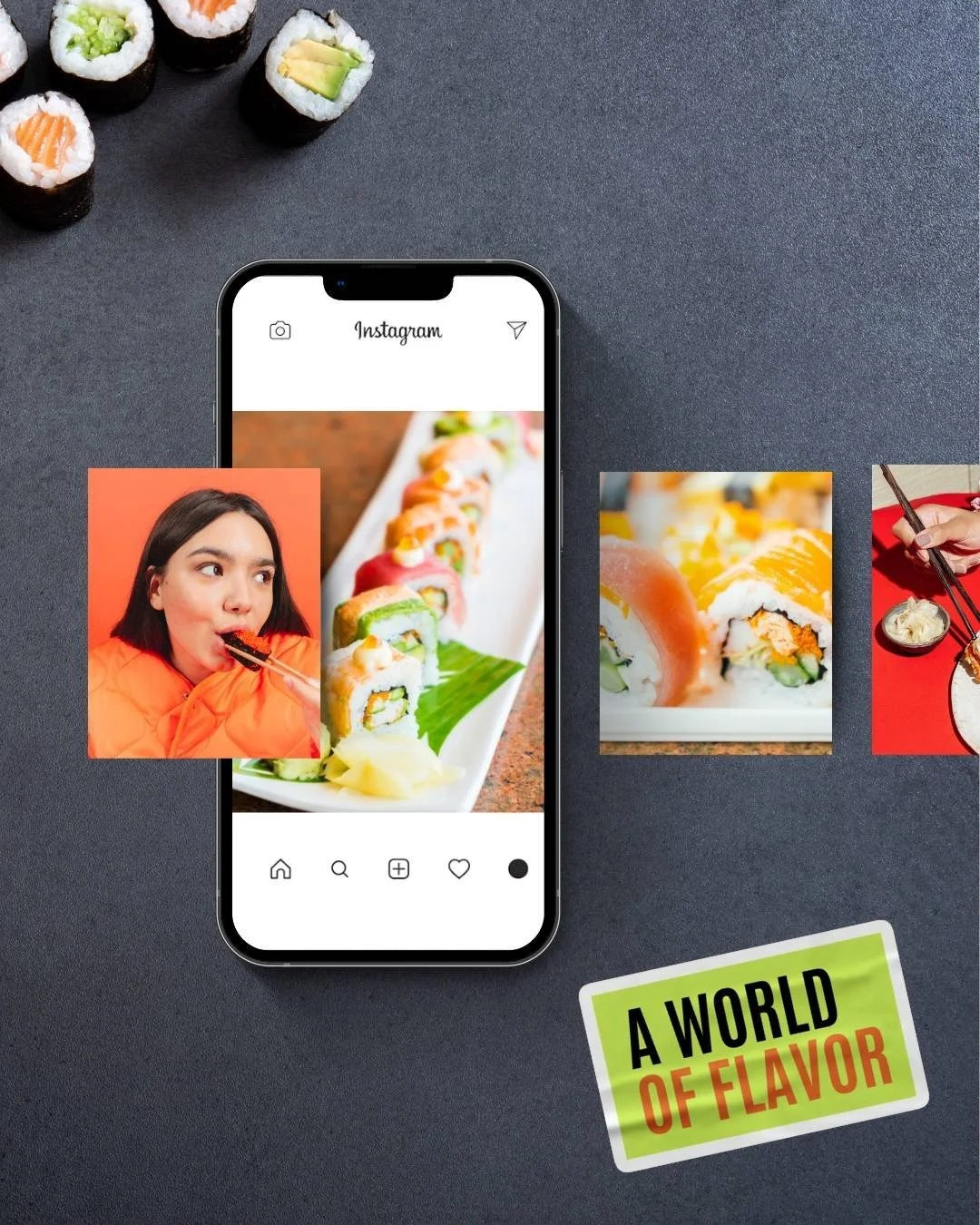
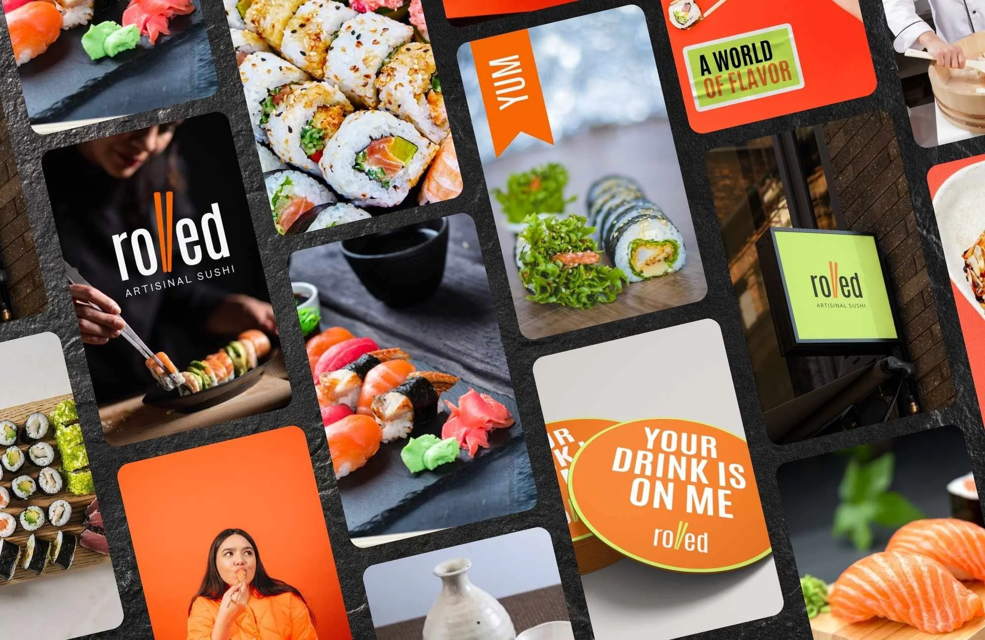
+Social Media Direction
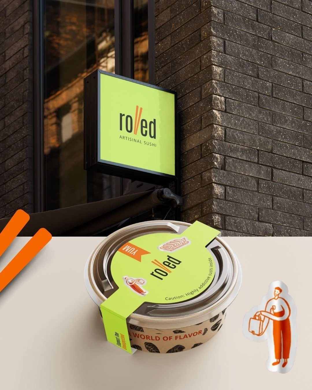
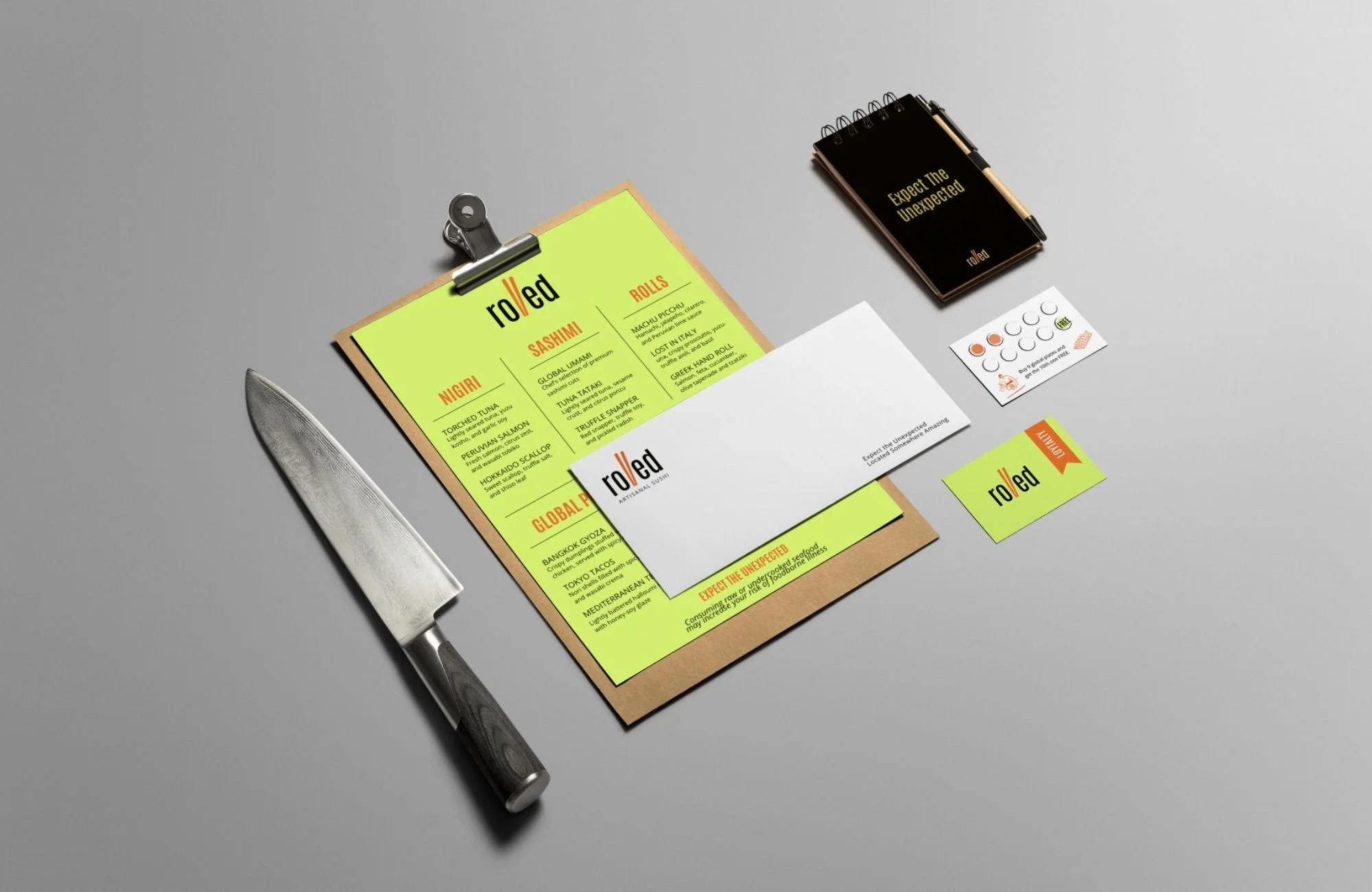
+Packaging & Menus
+Exterior Signage
+Logo Design
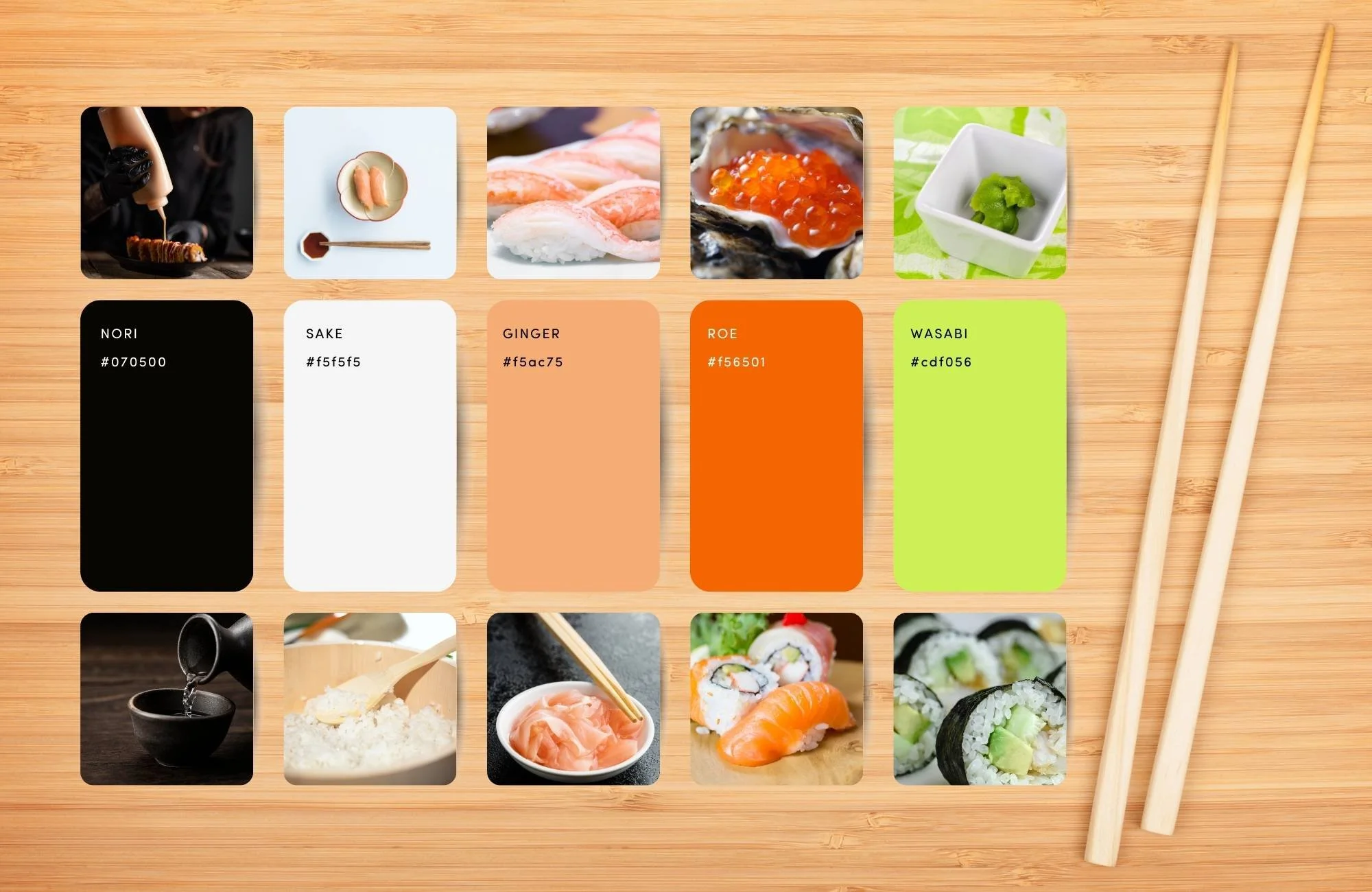
+Color Palette
+Typography
The Creative PROCESS
Great branding doesn’t start with design—it starts with strategy. We began with a deep dive into Rolled’s origins, flavors, and philosophy, capturing the fusion of Japanese tradition and global influences that makes it unique.
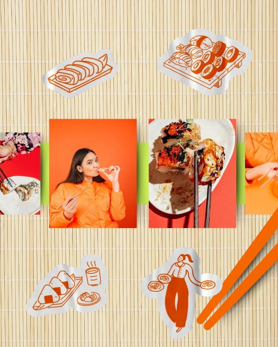
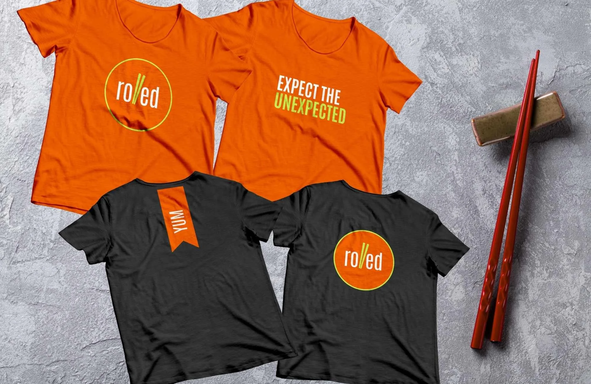
From there, we built a bold, high-energy identity—a look and feel that’s as innovative as the sushi itself. The logo, typography, and color palette reflect Rolled’s adventurous spirit, while custom illustrations, packaging, and marketing assets bring the brand to life across every touchpoint.
Final OUTCOME
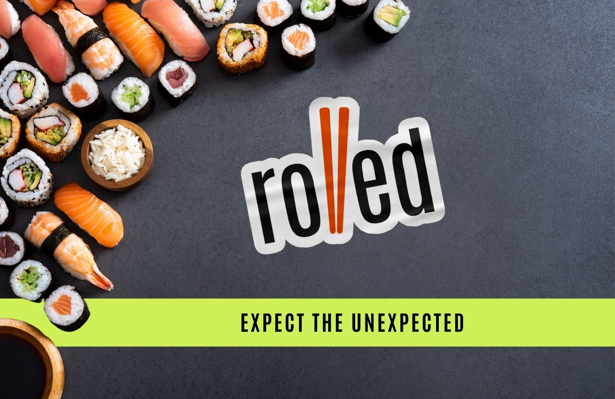
What emerged was a brand that feels fresh, modern, and undeniably Rolled. The logo’s playful chopstick-inspired typography, the vibrant lime green and deep umami tones, and the bold, dynamic messaging work together to create an unforgettable identity.
From packaging to signage to merch, every detail is designed to make an impact—turning first-time visitors into loyal fans and ensuring that Rolled stands out in a crowded market.

LIKE WHAT YOU SEE?
BOOK YOUR PROJECT
Schedule a call to get started.