
Your Website Has a Secret Dead End. Here's How to Turn It Into a Lead Generator.
Someone clicks a broken link to your website.
Maybe it was an old blog post you deleted. Maybe you changed your URL structure when you redesigned and forgot to redirect anything. Maybe someone just typo'd your domain name and ended up somewhere they didn't expect.
Either way, they land on your 404 page.
And what do they find?
If you're like most small business owners: whatever your platform installed by default. A generic error message. Maybe a sad little illustration. Definitely no personality, no direction, and no reason to stay.
They close the tab. You never knew they were there.
But here's what nobody tells you: that moment — the one where everything went wrong — is actually one of the best conversion opportunities on your entire website. You just haven't built anything there to take advantage of it.
The Page Nobody Actually Builds
Here's something I've learned after designing a lot of websites: almost nobody has a custom 404 page.
Not because it's hard. Not because it's expensive. Because it never occurred to them. The platform ships a default one, it technically works, and it never makes the to-do list.
Meanwhile, your homepage? You've agonized over every word. Rewritten the hero section four times. Asked three people if the tagline "landed."
Your about page? An emotional journey. You rewrote your bio until it felt like you, then second-guessed whether "feels like you" is actually good for business.
Your 404 page? It shipped with your theme. It's been there ever since, greeting every person who lands on a broken link with the energy of a shrug.
Here's the thing: someone landing on your 404 page isn't a random internet person who wandered in off the street. They clicked something. They were on their way to your site on purpose. They had enough interest to follow a link.
And then you handed them a dead end and wished them well.
What This Is Actually Costing You
Businesses with generic 404 pages lose 15–25% more visitors than those with intentionally designed ones. Not because the broken link drove them away — that already happened. Because there was nothing there to catch them.
A well-designed 404 page typically drops the bounce rate from around 94% to somewhere in the 65–70% range. For a site getting even 50 broken link hits a month, that's a meaningful number of people who stay engaged instead of disappearing forever.
And if you put an actual offer on that page — which we'll get to — those same pages can convert at 12–18%. That's often higher than a standalone landing page, because the person is already on your site, already a little disoriented, and actively looking for somewhere to go.
You're not going to get rich off your 404 page. But you are currently leaving something on the table every single month for zero good reason.
What a Converting 404 Page Actually Has on It
It's not complicated. You do not need a developer. You do not need a budget. You need to care about this page for approximately 32 minutes, which is 32 more minutes than most people have ever given it.
1. A headline that sounds like you.
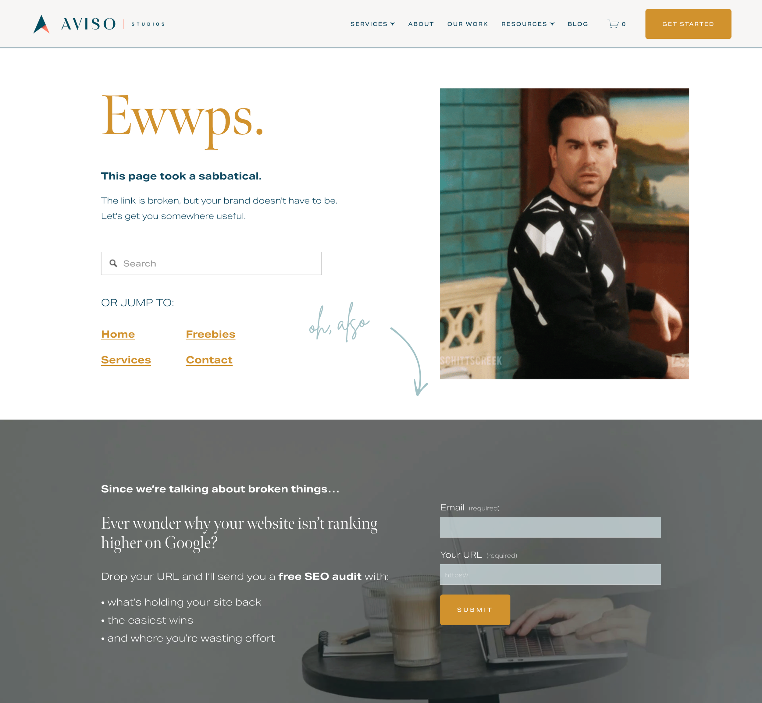
"Page not found" tells the visitor nothing and sounds like every other website on the internet. This is a moment where a little personality goes a long way. For my own site, I went with "Ewwps." Big. Gold. Serif. One word that immediately signals: yes, something went wrong, and also, we're normal people here.
2. A search bar.
The single highest-impact thing you can put on a 404 page. If someone can find what they were originally looking for without leaving your site, most of them will. Adding search typically improves engagement by 35–40%.
3. Three or four navigation links. Not your entire sitemap.
Think about who lands on broken links and what they probably wanted. Home (reorient). Services (commercial intent). Freebies (low-commitment, gets them into your world). Contact (ready to talk). That's it. You don't need to give them every blog post you've ever written. You need to give them four obvious doors.
4. An offer that makes sense in context.
This is the part most people skip entirely. Which is a shame, because the 404 page is one of the few places on your website where the moment actually hands you a perfect setup.
The Part Where the Broken Link Becomes the Pitch
For my own 404 page, the offer was obvious the second I thought about it.
I sell SEO audits. I help small business owners figure out why their site isn't showing up on Google and what to do about it. And someone just landed on a broken page on my website.
So the Call-to-Action (CTA) section at the bottom of my 404 page says: "Since we're talking about broken things — ever wonder why your site isn't ranking higher on Google?" Two fields. Email and URL. Submit.
The broken link is the pitch. I didn't have to manufacture the context. The moment handed it to me.
Your offer doesn't have to be an audit. It could be your best freebie, a checklist, a guide, a quiz. The question to ask is: what would be genuinely useful to someone who just landed on my site by accident and is deciding whether to stay? Answer that honestly and you've got your CTA.
One thing that matters: keep the form short. Two fields maximum. The person is already a little frustrated. They didn't come here to fill out paperwork.
Before and After: What This Actually Looks Like
Before:
Default Squarespace 404 template
"404: Page Not Found" in whatever font your theme defaulted to
Maybe a homepage link. Maybe nothing.
94% bounce rate. Zero leads. Zero recovery.
After:
"Ewwps." in big gold serif type, next to a David Rose GIF from Schitt's Creek
"This page took a sabbatical. The link is broken, but your brand doesn't have to be."
Search bar. Four navigation paths labeled by intent.
A dark CTA section with the SEO audit offer, two form fields, and copy that ties directly back to the broken link moment.
Built in one working session in Squarespace. Zero developer required.
Same website. Same traffic. Completely different outcome.
How to Build Yours (Yes, From Scratch)
Most people don't have a custom 404 page. They have whatever their platform installed by default — and they've never once thought about it. That's where you're starting, and that's fine. It's actually easier to build than you think.
If you're on Squarespace: go to Pages → Not Linked → Page 404. There's already a placeholder sitting there. You've just never opened it. Click in, add your blocks, write your copy, drop in a form, connect it to your email system. That's the whole thing.
Here's what to put on it:
A headline with personality. Make it sound like you, not like an error code.
One sentence of reassurance. Not an apology. Just direction.
A search bar.
3–4 navigation links. Home, Services, Freebies, Contact.
A contextual offer with a two-field form.
Then go to yourwebsite.com/this-page-does-not-exist on your phone and see what it looks like. That's your real 404 page. If it looks broken, fix it — 65% of 404 encounters happen on mobile.
One technical note worth knowing: your 404 page needs to return a proper 404 HTTP status code, not a 200. If it accidentally returns 200, Google thinks it's a real page and files it accordingly, which creates a whole different problem. You can check this free with any HTTP status checker, or open Chrome DevTools and look at the status code when you load the URL.
No Page on Your Website Gets to Be Lazy
There's no neutral. Every page either moves someone toward you or lets them drift away. Your homepage knows this. Your services page knows this. Your 404 page has been on vacation.
The fix is genuinely not hard. One session. A little copy. A search bar. An offer that makes sense. And suddenly a page that used to cost you visitors is quietly recovering them instead.
This is one of the things I build into every client website, because it's low effort and it works. And also because I think there's something deeply satisfying about a broken page that turns out to be the most useful one on the site.
Want me to build yours?
I design conversion-focused websites for small businesses and service providers — the kind where every page, including the ones people weren't supposed to land on, is doing something useful. If you're ready to stop leaving visitors on the table, start here.