
Chiropractic Website Design: Why Most Don't Attract the Right Patients (And What Actually Does)

Somewhere right now, a potential patient is on your website.
She found you through Google. She’s exactly who you want to work with. And she’s giving your homepage about three seconds—maybe less—before she decides whether you’re the chiropractor to call.
And your website is out here looking like every chiropractor on the internet had a group project and you all turned in the same thing.
White background. Blue accents. A stock photo from 1993 of someone holding their lower back in a way no real human has ever actually stood. A headline about “whole-body wellness” or “getting to the root cause,” which—unfortunately—is also the headline of the last six websites she just clicked through.
Nothing about it feels wrong.
It just doesn’t feel like anything.
So she keeps scrolling. You’ll never know she was there.
Here’s what makes this particularly frustrating. You are almost certainly not doing generic work.
You’ve spent years moving past the in-and-out, crack-and-go model. You’ve built something more thoughtful. Maybe it’s nervous system-focused care. Maybe it’s perinatal or pediatric work. Maybe it’s long-term, whole-family support that doesn’t fit neatly into a list of conditions.
Your existing patients get it. Your referrals get it.
Your website doesn’t.
The problem isn’t your website. It’s that your website looks and sounds like everyone else’s.
Most chiropractic websites follow the same structure because the entire industry has been nudged in that direction.
The healthcare-specific website companies, the templates, the “we specialize in medical practices” designers—they’re all working from the same playbook. Headline about pain relief. List of services. A few trust badges. A “Book Now” button. Clean, inoffensive, and completely interchangeable.
So when every practice is saying the same things in the same way, it becomes nearly impossible for someone to understand why they should choose you specifically.
Your potential patient isn’t thinking, “this is exactly what I’ve been looking for.”
She’s thinking, “this looks like every other chiropractor I’ve seen.”
And she’s not wrong.
Your website describes what you do. It has no idea how you do it.
This is the part where most practitioners start nodding a little—and then, if they’re being honest, get a little uncomfortable.
Because most chiropractors aren’t doing generic work. They have a philosophy. A specific type of patient they do their best work with. A way of practicing that’s meaningfully different from the clinic down the street.
But their website? Lists services.
Adjustments. Sports injuries. Prenatal care. Maybe a paragraph or two about holistic health.
It’s a menu, not a message.
And a menu tells someone what you offer. It doesn’t tell them why it’s different, who it’s really for, or whether they should trust you with their health journey.
The people finding you through Google don’t have the context your long-term patients do. They just have your website, their own skepticism, and a very short window to decide whether to keep reading.
You can’t out-market a perception problem.
You can only fix it.
What’s actually happening in the first few seconds on your site
When someone lands on your website, they’re not reading it carefully. They’re scanning.
And while they’re scanning, there are a few questions running quietly in the background:
What is this, really? Not “what is chiropractic care,” but what kind of practice is this?
Is this for me? Does anything here signal that this person understands my situation, my stage of life, what I’m dealing with?
Do I trust this person enough to reach out?
If your site can’t answer those quickly—clearly, without effort—people don’t dig deeper. They don’t click around trying to piece it together. They leave.
Quietly. Without filling out a form. Without booking. Without you ever knowing they were there.
The gut check (read this part slowly)
There are a few patterns that tend to show up together when a chiropractic or wellness website isn’t doing its job.
If you’re reading this, see what lands.
If someone removed your logo and your name from your homepage, would it still feel like your practice? Or could it be swapped with the chiropractor down the street and no one would notice?
Are you doing a lot of explaining on the phone? Walking every new inquiry through your approach, clarifying how it’s different, filling in gaps your website didn’t cover?
Are you attracting people who aren’t quite the right fit? People looking for something quick, or who seem confused about what you actually do once they arrive?
None of that is random.
It’s a gap between how your practice actually operates and how it’s being presented.
What this looks like when it’s done well
A website that attracts the right patients isn’t necessarily more complex or more expensive.
It’s clearer.
It communicates your approach without requiring someone to dig for it. It speaks to a specific kind of person instead of trying to be everything to everyone. And it gives someone a sense of what it will feel like to work with you before they ever step into your office.
You can see the difference almost immediately.
Two chiropractors. Same city. Similar training.
One says:
“Chiropractic care for the whole family. Book your appointment today.”
The other says:
“Your nervous system runs everything. We help it do its job.”
Same general service. Completely different first impression.
One blends in. The other gives someone a reason to pause.
What happens when the website finally catches up to the work
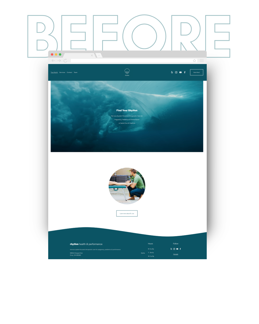
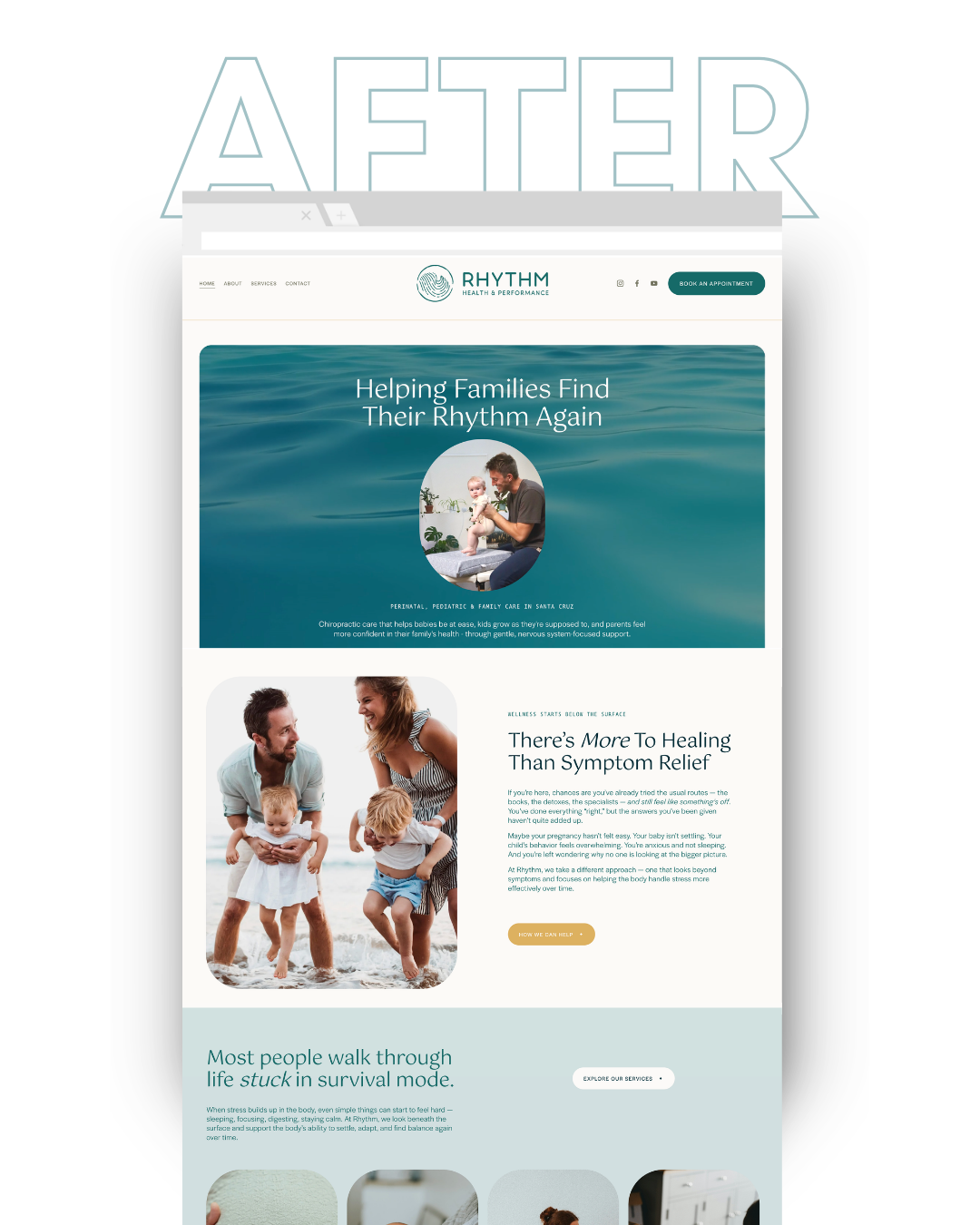
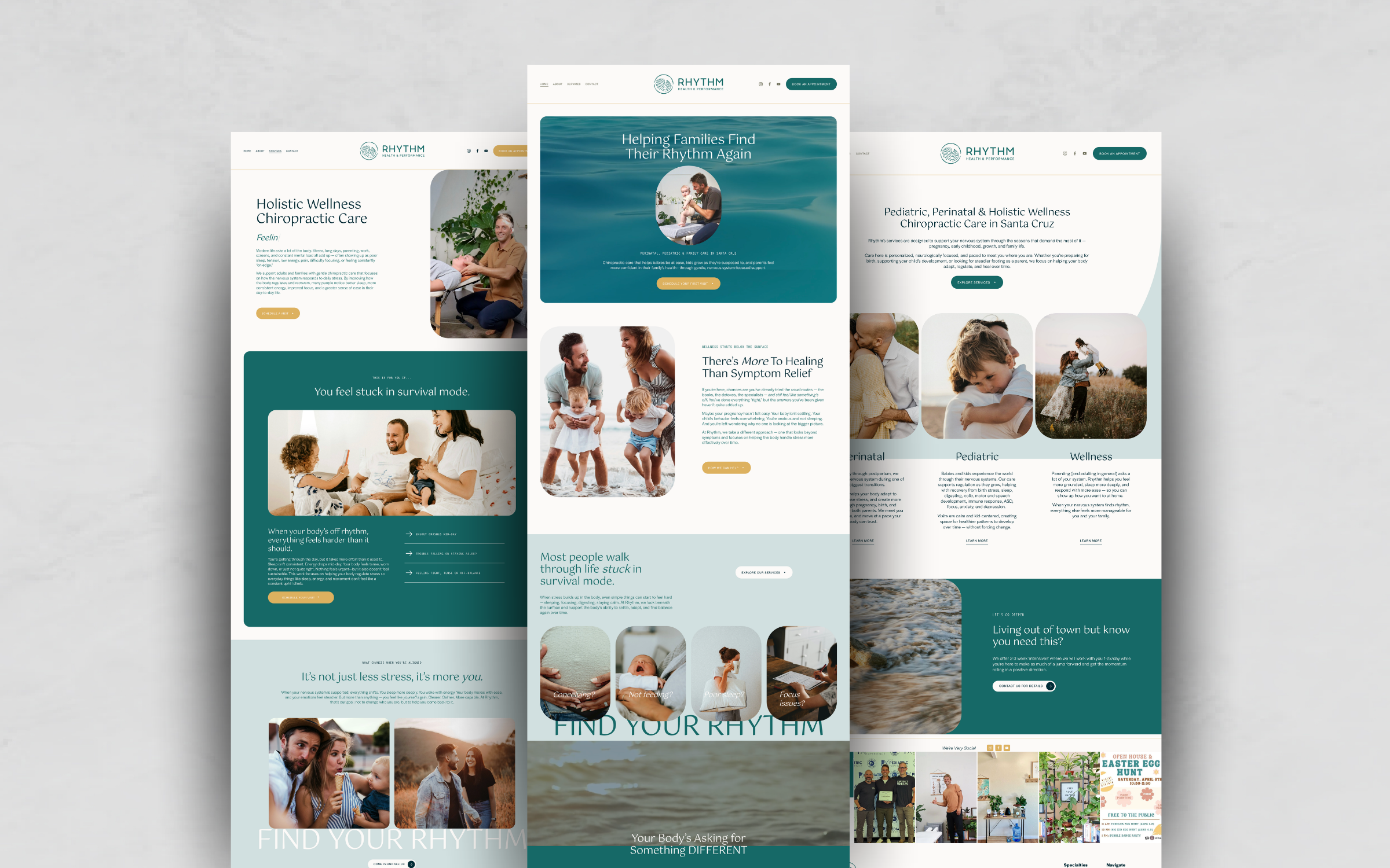
One of my clients, Dr. Joe at Rhythm Health & Performance, was in the middle of exactly this shift.
He had built a strong practice. A clear direction. A reputation that spoke for itself (a la gazillions of 5-star Google reviews). His work had evolved into something much more specific—nervous system–based care, with a deep focus on perinatal and pediatric patients.
But his brand and website?
Didn’t reflect any of that.
It leaned heavily into the same visual and messaging patterns you see everywhere else. The kind of branding that feels safe, familiar, and very easy to overlook.
There was nothing that immediately communicated, “this is different,” or “this is for you.”
So we rebuilt it—starting with strategy, not visuals—to close that gap.
We clarified the positioning. Tightened the messaging. Shifted the visual direction to feel more grounded and human. Reworked the structure so the site builds trust before it asks someone to book.
The goal wasn’t to make it look better for the sake of it.
It was to make it clearer.
If you want to see how that came together in more detail, you can take a look at the full case study here:
The part you already know (but probably haven’t acted on yet)
Most chiropractors and health and wellness practitioners reading this already have a sense that their website isn’t fully reflecting the level of their work.
They can feel it.
It’s just been sitting in that category of “I’ll deal with this later.” When there’s more time. When things slow down. When it feels easier to take on.
In the meantime, the gap stays.
And that gap shows up in ways that don’t always look obvious at first. In the kinds of inquiries coming through. In how much explaining has to happen on calls. In how often referrals don’t quite convert the way they should.
Your website is either supporting your practice or it isn’t.
There’s not really a middle ground.
Where to go from here
If you’re recognizing your own site in this, the first step isn’t necessarily to tear everything down and start over.
It’s to look at what you currently have with a little more distance.
Open your homepage as if you’ve never seen it before. Assume you don’t know anything about your own work. See what it actually communicates—and what it leaves out.
If you want to see what this looks like when it’s done well, the Rhythm case study walks through the full process—from positioning to design to how the experience comes together.
And if you’re at the point where you’re ready for your brand and website to actually reflect the work you’ve built—

Request a Free 15-Minute Homepage Review
I’ll record a short video walkthrough of what’s working, what’s blending in, and where a different approach could make the biggest impact.
DROP YOUR DETAILS BELOW ⬇️ ⬇️ ⬇️