
Why Your Brand Colors Matter More Than You Think (And How To Choose Them)
People remember what they see before they remember what they read.
Studies show we form a first impression of a brand in just 90 seconds, and up to 90% of that decision is based on color alone. Color can also increase brand recognition by 80% and directly influence buying decisions (with 85% of shoppers saying it’s a key reason they choose a product).
That means your brand colors aren’t just about “looking nice.” They’re setting the tone for how your audience experiences your business—before a single word is spoken.
So, if you’ve been stuck in decision-mode trying to land on the “perfect palette,” here’s the 5-step process we use at Aviso Studios to create colors that not only look great but also work strategically.
1. Define Your Brand Words ✍️
Start with words, not colors.
Ask yourself:
How do I want clients to feel when they interact with my brand?
What adjectives describe the nature of my industry? (For example, “understanding” for a psychologist or “energetic” for a fitness coach.)
What’s it like to work with me personally?
Write down 3–5 adjectives like calm, bold, playful, warm, high-end, or approachable. These words become your anchors for every color choice you’ll make.
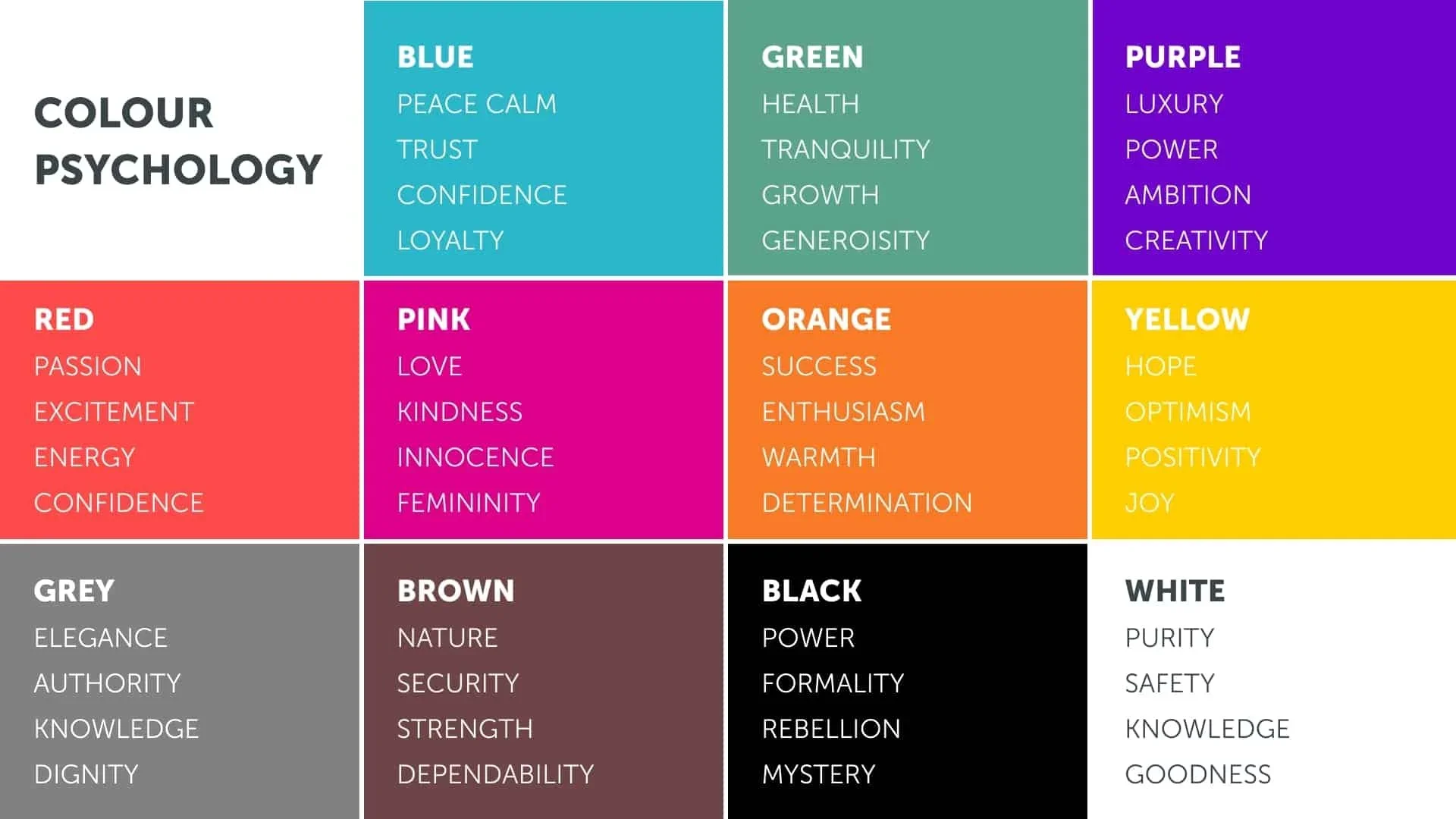
2. Tap Into Color Psychology 🧠
Colors trigger emotions. They communicate in ways words can’t—and often faster. Here are a few examples:
Blue → trust, reliability, calm (why banks and tech brands lean on it)
Green → growth, balance, health (why wellness and eco-friendly brands love it)
Red → energy, passion, urgency (why retailers use it for sales and promotions)
Yellow → optimism, creativity, warmth (great for playful, positive brands)
Black → luxury, sophistication, authority (a favorite in high-end fashion and design)
Pick one or two main colors that best represent the brand words you defined in Step 1.
3. Gather Inspiration 📌
Now that you know the “why” behind your colors, it’s time to explore the “what.”
Pinterest is a great tool for this. Try searching combinations like:
“[Adjective] + brand colors”
“[Adjective] + color palette”
“Playful pink brand” or “Minimal beige palette”
Save the palettes that resonate. Over time, you’ll notice patterns that feel aligned with your brand.
4. Build and Refine in Canva 🎨
Upload your inspiration images into Canva and use the eyedropper tool to capture exact shades. Drop these colors into circles or squares so you can see them side by side.
This step makes your palette tangible. Once you have a base, adjust tones until the colors feel cohesive and true to your brand’s personality.
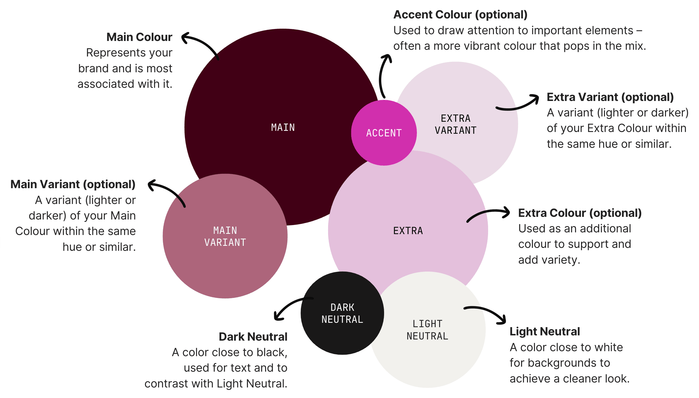
5. Apply a Palette Framework 🧩
A good palette isn’t just about aesthetics—it needs balance and functionality. Here’s a simple framework:
Main Color → your hero shade
Accent Color(s) → adds personality and contrast
Light Neutral → for backgrounds and breathing room
Dark Neutral → for text and high contrast
Stick to 3–7 colors total. More than that, and your palette starts to feel cluttered.
Ready to Build a Palette That Works?
Follow these steps, and you’ll move from “random Pinterest inspo” to a brand palette that actually works for your business. One that looks polished, feels aligned, and creates the right first impression every time.
And if you’d love a professional eye (or a full brand refresh)… that’s where we come in.
How Aviso Studios Can Help
At Aviso Studios, we design brands that don’t just look good—they connect, convert, and last.
Here’s how we can support you:
💡 Brand Strategy + Identity Design → A full visual identity built from the ground up
🎨 Color Palette Refresh → Perfect if your brand feels outdated or inconsistent
⚡ Brand in a Day Intensives → A fast-track option to a refreshed look
🔁 Ongoing Support → Keep your branding cohesive across all touchpoints
👉 Explore our branding services
👉 Book a call with us
Color isn’t decoration. It’s strategy in disguise. And when you choose the right palette, you’re not just picking pretty shades—you’re shaping the way your audience feels about your business from the very first glance.
About the Author
I’m Liz Kroft, a Santa Cruz California-based marketing strategist and founder of Aviso Studios.
With a Digital Marketing certification from Harvard Business School, I help small businesses and entrepreneurs across the U.S. grow through branding, website design, SEO and digital marketing that actually gets results.
Ready to get seen? — Want help boosting your visibility, optimizing your website, or growing your brand with strategy that actually works? Explore our marketing services or schedule a free strategy call today.