Your Therapy Website Is Asking Too Much of Someone Who’s Already Overwhelmed
Someone looking for a therapist probably isn’t visiting your website on their best day.
They may be anxious, overwhelmed, grieving, struggling in a relationship, dealing with trauma, or finally trying to put words around something that hasn’t felt right for a long time.
Then they land on a website that asks them to read hundreds of words, understand the difference between six therapeutic modalities, decipher clinical language, sort through a list of specialties, figure out whether you see people like them, what it’s like to talk to you, find your location, understand your session options and decide whether they’re ready to contact you.
That’s a lot to ask of someone who came looking for help.
I was reminded of this recently while redesigning a website for a private practice therapist. She had spent years adding to it as her practice evolved, which is exactly what most small business owners do. There was plenty of good information on the site.
The problem was what she was asking a prospective client to do with all of it.
Therapist Websites Have a Different User Experience Problem
User experience gets talked about a lot in website design, usually in terms of navigation, mobile design, page speed and whether someone can find the right button.
All of that matters. But for a therapist, I think user experience starts a little earlier.
It starts with the emotional state of the person arriving on the website.
A prospective therapy client may have spent weeks or months thinking about reaching out. Maybe someone finally encouraged them to. Maybe something happened that made getting help feel more urgent. Maybe they’re sitting on the couch at 2 a.m. opening therapist websites in six different tabs.
They’re not necessarily approaching your website with the attention span or mental bandwidth of someone researching a new accountant.
That should influence how the website is designed.
The goal isn’t to strip away important information or make everything ridiculously simple. It’s to create enough structure that someone can find what matters to them without having to understand your entire practice first.
Your Website Shouldn’t Require Clients to Understand Your Filing System
This was one of the biggest things I noticed on the therapist website I recently redesigned.
Specialties, therapeutic modalities, session information and details about the process were mixed together. Someone could move from addiction recovery to EMDR to session length to codependency, then eventually discover couples therapy farther down the page.
All of those things belonged on the website. They just didn’t all answer the same question.
A specialty like addiction recovery helps someone figure out whether you work with what they’re experiencing. A modality like EMDR explains something about how therapy might work. Session length, telehealth options and what to expect are about the logistics and experience of working together.
A therapist understands those distinctions automatically. A prospective client may not.
Your website shouldn’t require them to figure out your filing system before they can figure out whether you can help them.
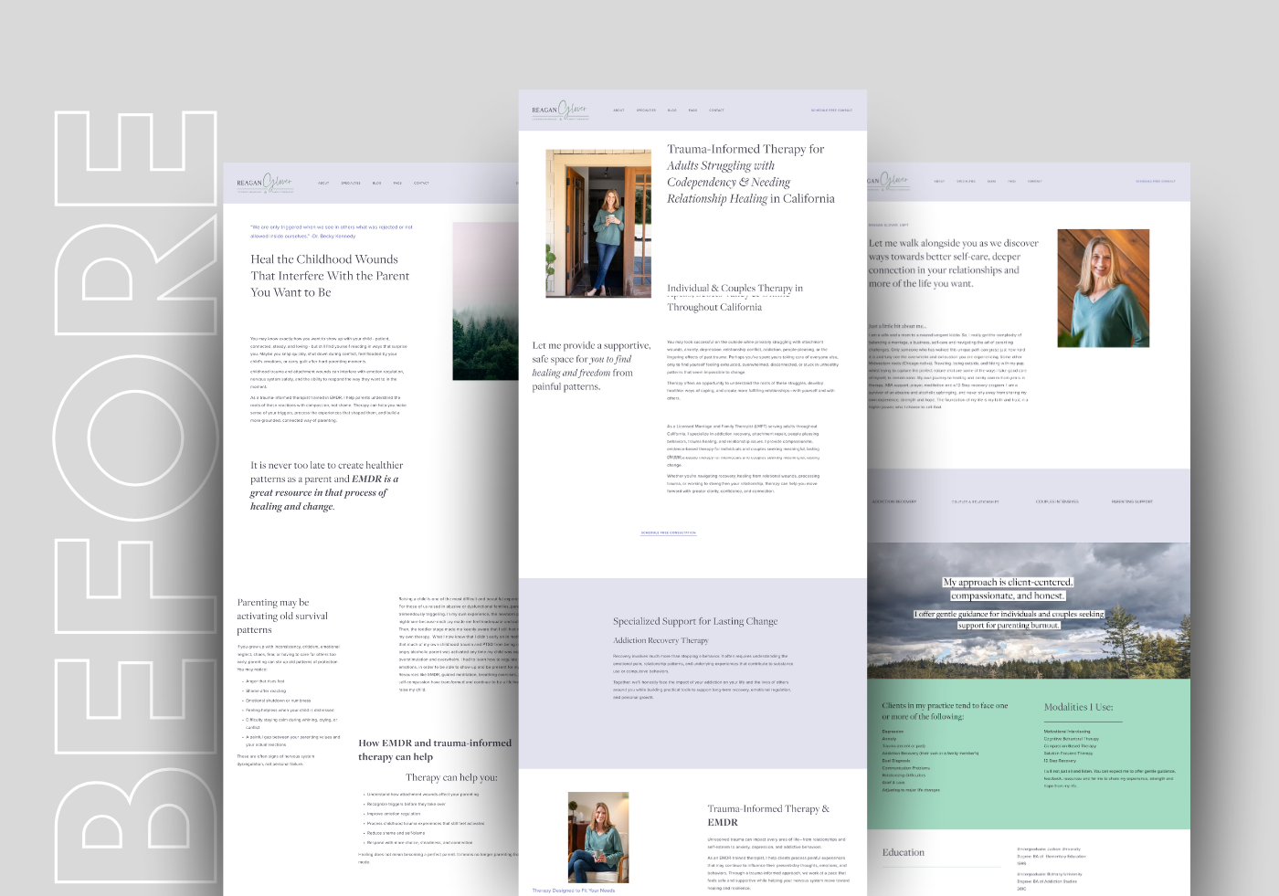
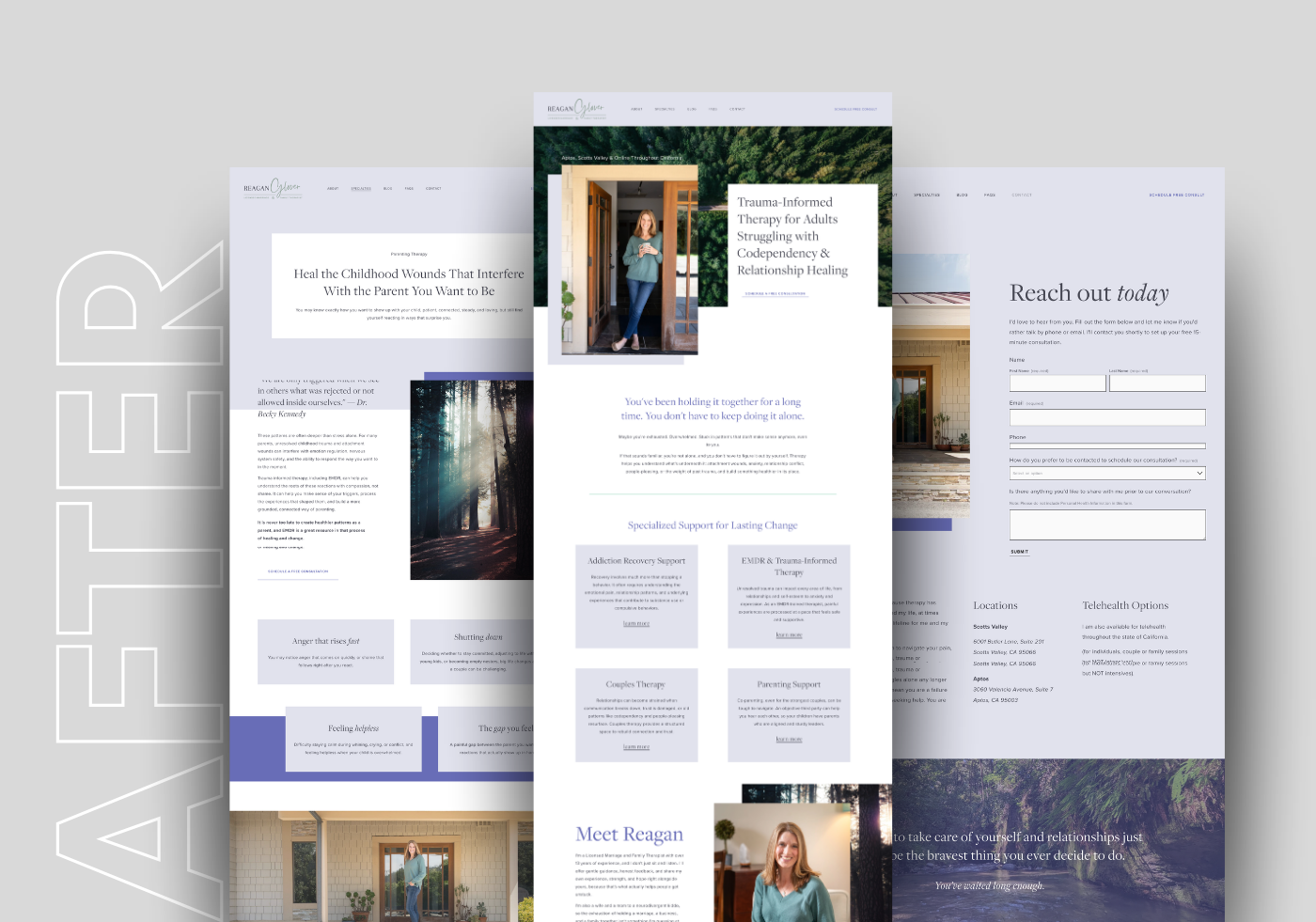
So we reorganized the site around the questions someone would naturally have as they considered working with her. That changed the navigation, page structure, headings, copy and calls to action. It also made the website feel calmer visually because we were no longer asking every section to do everything at once.
Your Prospective Client Probably Doesn’t Speak Therapist
There’s another problem I see on health and wellness websites in general, but it’s especially common with therapists: writing for people who already understand the profession.
Clinical language has a place. Sometimes it’s the most accurate way to explain something. But your prospective client may not know which modality applies to them, or even have the vocabulary to describe what they’re experiencing.
They know they can’t stop thinking about something that happened. Their relationship feels impossible lately. They’re exhausted from keeping everyone else happy. They feel anxious all the time and don’t entirely understand why.
If your website makes them translate those experiences into professional terminology before they can recognize themselves in your services, you’ve added another hurdle between them and getting help.
This doesn’t mean turning your website into a collection of vague lines about “living your best life.” Please don’t.
It means using the language your clients actually use alongside the professional language that establishes what you do. Good therapy website copy helps someone recognize their own experience, then gives them language for the kind of support that might help.
Sometimes the Clinical Term Is Exactly What Someone Is Searching For
This is where blanket advice like “don’t use jargon” falls apart.
During this project, I asked the therapist what she wanted to become better known for. One of her answers was EMDR. She had recently completed additional training, wanted to grow that part of her practice and knew there were prospective clients specifically looking for it.
Her existing website mentioned EMDR, but it didn’t have a dedicated page explaining the service.
So we built one.
Someone searching specifically for an EMDR therapist may already know exactly what EMDR is. The clinical term isn’t confusing them. It’s literally what they typed into Google.
Someone else may encounter EMDR on the website without knowing much about it at all. A dedicated service page can serve both people. It gives the person actively searching for EMDR a clear destination while giving someone less familiar with it enough context to understand what it is and whether they want to learn more.
That’s also where website strategy and SEO start doing the same job. If there’s a specific service you want to grow and people are actively searching for it, hiding it in a paragraph halfway down a general Services page probably isn’t doing anyone any favors.
Wondering What Your Website Is Asking Clients to Figure Out?
Sometimes it takes a fresh set of eyes to see where the experience gets confusing. I offer website reviews for health and wellness businesses that look at your site from both sides: what your prospective clients need to find and understand, and what search engines need to make sense of your business.

Why Isn't Your Website Bringing In More Business?
PERSONALIZED WEBSITE REVIEW
Get a 20-minute video review of your website with practical, personalized recommendations.
Learn what's working, where visitors may be getting confused, and what to improve first so your website better communicates your services, gets found in Google and AI search, and turns more visitors into inquiries.
Your Website Also Has to Help Someone Get a Feel for You
A prospective therapy client isn’t only evaluating whether you technically provide the service they need. They’re trying to get some sense of whether they could sit in a room with you and talk about things they may not tell many other people.
Your website can’t manufacture that connection, and I don’t think it should try. But it can give someone a clearer sense of the person behind the practice.
That changes how I think about About pages, copy and even photography on therapist websites.
For this project, we didn’t have an enormous library of professional brand photography. We had a handful of photos of the therapist and quite a few nature images. So I used what we had intentionally. Seeing her mattered in places where we were building familiarity. Elsewhere, imagery could create breathing room without pretending a stock photo of a woman thoughtfully drinking tea was somehow a representation of the therapy experience.
You don’t need 75 brand photos to build a good therapist website. You do need to think about what each image is doing there.
Don’t Bury the Practical Stuff Either
Eventually, someone needs to know whether working with you is actually possible.
Where are you located? Do you see clients in person? Do you offer telehealth? Who do you work with? How does someone get started?
The therapist in this project was seeing roughly 85% of her clients in person when we first spoke, with telehealth also available. That made her physical location in Scotts Valley important information for prospective clients and for local search.
If most of your clients are local, your website should make that obvious. Someone shouldn’t reach the bottom of your Contact page before realizing your office is ten minutes from their house.
This is one of those places where good SEO and good user experience are trying to solve the same problem: be clear.
Pretty Isn’t Enough
We kept a substantial amount of the therapist’s existing content, branding, colors and typography. What changed was the experience around them. Information was reorganized, copy was refined, services became easier to understand, calls to action became more intentional and each page had a clearer purpose.
The site looked significantly better afterward, but that wasn’t because we sprinkled some design magic over it.
It looked better because the information finally had hierarchy.
You can buy a beautiful Squarespace template tomorrow and pour the exact same disorganized information into it. You’ll have prettier typography and the same underlying problem.
Website design is also deciding what someone needs to know, when they need to know it and what should happen next.
Look at Your Therapy Website on a Bad Day
If you’re a therapist who has built or maintained your own website, try looking at your homepage differently.
Pretend you know nothing about therapy.
Better yet, pretend you’re having a terrible week.
You don’t know whether you need EMDR, CBT, somatic therapy or something else. You’re not even sure what kind of therapist you’re supposed to be looking for. You just know something isn’t working and you’ve finally decided to get some help.
Now open your website.
Can you quickly understand who you help? Can you recognize yourself in the language? Can you figure out what the therapist specializes in without understanding a dozen clinical terms? Can you tell where they’re located and whether they see people in person or online? Do you know what to do next?
And how much energy did all of that require?
Those questions matter more to me than whether your homepage follows whatever website design trend is popular this year.
Because a therapy website doesn’t need to explain everything you know about therapy.
It needs to help someone who may already be carrying a lot figure out whether you’re the person they want to talk to about it.
Your Website Should Make It Easier to Take the Next Step
If your therapy practice has grown but your website hasn’t quite grown with it, I can help.
Aviso Studios designs and redesigns websites for therapists and other health and wellness businesses with strategy baked into the process, from messaging and user flow to SEO, service structure and the actual experience of finding the right information.
The goal isn’t to make your website look more impressive. It’s to make it easier for the right person to find you, understand how you can help, and feel comfortable taking the next step.
READY FOR A WEBSITE THAT BRINGS IN BUSINESS?