Too Many Choices, Not Enough Customers? The Psychology Behind Why People Don't Buy
You know that feeling when you open a restaurant menu and immediately regret agreeing to go out for dinner?
There are 47 entrées, six different preparations of salmon, an entire page dedicated to sides, and somehow you've spent more time studying the menu than you did deciding where to eat.
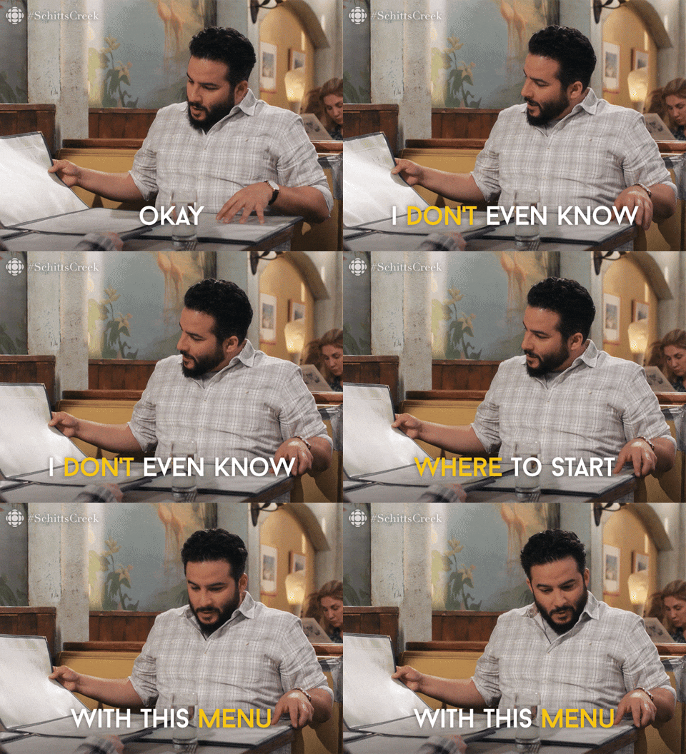
So you order the same thing you always order. Or ask the server what they recommend. Because at some point, you just want someone to make the decision easier.
Your customers do this, too.
Except instead of choosing between the salmon and the short ribs, they're comparing your services, packages, pricing, products, and booking options.
And while giving people plenty of choices might seem like good customer service, more options don't necessarily lead to more sales. Sometimes, they make choosing harder.
There's a fascinating bit of behavioral psychology behind this, and understanding it can help you create a better customer experience, improve your website, and make it easier for people to do business with you.
Let's get into it.
What Is Choice Overload?
Choice overload, sometimes called the paradox of choice, describes what can happen when people are presented with more options than they can comfortably evaluate.
Instead of feeling empowered by all those possibilities, they may feel overwhelmed, uncertain, or worried about making the wrong decision.
And when choosing requires too much mental effort, putting off the decision becomes an attractive option.
Think about the last time you tried to pick a new show on Netflix. Hundreds of options, dozens of categories, personalized recommendations, and somehow you spend 20 minutes scrolling before giving up and watching The Office again.
That's the basic idea.
Now, choice overload isn't a universal rule. Research shows that the effects depend on several factors, including how complicated the options are, how well people understand their preferences, and how difficult it is to compare alternatives.
Someone who knows exactly what they're looking for may appreciate having 30 options. Someone who doesn't know where to start might struggle with five.
The issue isn't necessarily how many choices you offer. It's how much work your customers have to do to make one.
And that's where marketing comes in.
The Famous Jam Experiment (And What It Actually Tells Us)
One of the most frequently cited studies on choice overload involves something wonderfully ordinary: jam.
In 2000, researchers Sheena Iyengar and Mark Lepper conducted a field experiment at an upscale grocery store, where shoppers encountered a tasting display featuring either six or 24 varieties of jam.
The larger display attracted more attention. Approximately 60% of shoppers stopped at the display with 24 jams, compared with 40% at the smaller display.
More options meant more interest.
But here's where things got interesting.
Of the shoppers who encountered the smaller selection, approximately 30% purchased jam. Among those who encountered the larger selection, only about 3% made a purchase.
Let that sink in.
The display with more choices attracted more people, but the display with fewer choices converted a much higher proportion of those who stopped.
Now, before you rush off to delete half your services, there's an important caveat.
Subsequent research, including a 2010 meta-analysis by Benjamin Scheibehenne, Rainer Greifeneder, and Peter Todd, found that choice overload doesn't happen consistently across every situation.
Sometimes more choices help. Sometimes fewer choices help. Sometimes the number of choices makes little difference.
The context matters.
And that's the lesson worth applying to your business.
Getting someone's attention and helping them make a decision are two different jobs.
A wide selection might attract interest, but customers still need a manageable way to evaluate their options and decide what fits.
“A wealth of information creates a poverty of attention.”
Herbert A. Simon, Nobel Prize-winning economist (1971)
How Choice Overload Shows Up in Small Business Marketing
This isn't limited to e-commerce websites with hundreds of products.
In fact, I see versions of this problem regularly with countless service-based businesses.
The business owner wants to be helpful. They have a crap-ton of expertise, offer several valuable services, and don't want to leave anything out.
So they put everything in front of the customer.
Every treatment. Every specialty. Every package. Every possible way to work together. (Usually ALL on their website homepage).
And suddenly, someone who arrived ready to book an appointment is wondering whether they need a consultation, an assessment, a particular treatment, or something else entirely.
Let's look at a few examples.
1. The Spa With 20 Different Treatments
You're booking a spa day. Nothing complicated. You want to relax, unwind, and treat yourself to a massage.
Then you open the services menu.
Swedish massage. Deep tissue. Hot stone. Aromatherapy. Himalayan salt stone. Lymphatic drainage. Several signature treatments, each with different durations and add-ons.
They all sound lovely.
But now you're trying to figure out which one is actually relaxing, whether deep tissue will leave you sore, and what makes the signature massage worth an extra $75.
You were ready to book. Now you're researching massage techniques.
The fix: Help customers choose based on the experience they're looking for, not just the treatments available.
Group services around goals like relaxation, muscle recovery, or stress relief. Explain the differences in plain language and recommend a starting point for first-time visitors.
The spa doesn't need to eliminate its treatments. It just needs to make choosing one easier.
2. The Photographer With Six Different Packages
You're looking for a photographer to take updated photos for your business.
You find someone whose work you love. Their portfolio looks fantastic, their style is exactly what you want, and you're ready to inquire.
Then you hit the packages.
There's a mini session, a signature session, a branding session, a half-day experience, a full-day experience, and a custom collection. They all have subpackages depending on the day of the week, how many photos you want and your desired turnaround time. Each includes different shooting hours, outfit changes, image counts, and editing options.
You wanted some great photos. Now you're comparing deliverables, trying to anticipate how many images you'll need, and wondering whether booking the smaller package will be a mistake.
The fix: Explain the packages in terms of what customers are trying to accomplish.
A mini session might be perfect for updated headshots. A branding session might suit a business owner who needs photos for their website and social media. A full-day session might make sense for a company building an extensive image library.
Customers can still compare the details, but now they have a meaningful starting point.
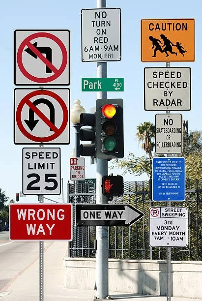
3. The Website With Too Many Calls to Action
Let's say someone lands on your homepage and immediately sees:
Book a Call
Download Our Guide
Explore Services
Join Our Newsletter
Take Our Quiz
View Our Portfolio
None of these actions is inherently wrong.
But when they're competing for attention, visitors have to figure out what they're supposed to do next.
And if every action is visually emphasized, nothing feels particularly important.
The fix: Establish a primary next step based on the page's purpose and the visitor's likely intent.
Secondary actions can still exist. They just shouldn't compete equally with the one that matters most.
This is as much a website design decision as it is a copywriting decision.
Why Your Customers Struggle to Choose
There are a few psychological factors worth understanding here.
Cognitive Load: You're Asking People to Think Too Hard
Cognitive load refers to the mental effort required to process information.
Every unfamiliar term, complicated comparison, unnecessary form field, and unclear instruction adds work.
Imagine trying to compare three website design packages.
One includes “strategic discovery and UX optimization.” Another includes “conversion architecture and technical SEO.” A third includes “brand alignment and digital experience development.”
Fantastic. But what does any of that mean to someone who just needs a better website?
When customers have to decode your language before they can evaluate your services, you're making the decision harder than necessary.
Plain language, meaningful distinctions, and organized information reduce that effort.
Decision Uncertainty: What If I Choose Wrong?
Some decisions feel riskier than others.
Choosing the wrong candle scent is inconvenient. Choosing the wrong healthcare treatment, business consultant, or expensive service package can feel consequential.
The higher the perceived stakes, the more reassurance someone may need.
That might mean understanding what happens during an initial appointment, seeing examples of previous work, reading testimonials, or having an opportunity to ask questions.
Sometimes customers aren't struggling because they have too many choices.
They're struggling because they don't have enough information to feel confident about any of them.
Unclear Preferences: I Don't Know What I Need Yet
This is especially relevant for businesses offering specialized services.
You understand your industry. Your customers probably don't.
A landscape contractor knows the difference between various drainage solutions.
A prospective homeowner knows their yard floods every winter.
A marketing strategist knows when a business needs positioning work rather than a new website.
A business owner knows their marketing isn't producing enough inquiries.
See the disconnect?
Customers often arrive knowing what they want to accomplish, not which service will accomplish it.
Your job is to help bridge that gap.
Wondering If Your Website Is Making Customers Work Too Hard?
Let's find out.
Get a free, personalized video review of your homepage with an outside perspective on what's working, what's creating friction, and where there's room to improve.
6 Ways to Make Choosing Easier (Without Offering Less)
Here's the practical part.
You don't necessarily need fewer services, products, or packages. You need to organize and present them in a way that makes sense to the people buying them.
1. Recommend a Starting Point
One of the easiest improvements you can make is telling people where to begin.
That might look like:
“New here? Start with an initial consultation.”
“Not sure which treatment is right for you? We'll help you decide.”
“Planning a complete backyard renovation? Explore our design and installation process.”
You're not taking away someone's options.
You're helping them make their first decision.
This works particularly well for healthcare practices, consultants, coaches, and other businesses where the right solution depends on individual circumstances.
2. Group Services Around Customer Needs
Your internal business structure doesn't always match the way customers think.
You might organize services by technique, specialty, practitioner, or delivery method.
Your customers may be thinking about goals, symptoms, challenges, or outcomes.
Consider a home services business.
Instead of presenting a long alphabetical list of everything it offers, it could organize services into categories such as:
Outdoor Living: Patios, outdoor kitchens, walkways, and entertaining spaces.
Property Improvements: Drainage, retaining walls, grading, and erosion control.
Gardens & Orchards: Installation, irrigation, and ongoing care.
Same services. Easier navigation.
And customers can identify the category most relevant to what they're trying to accomplish.
3. Make the Differences Obvious
If you offer multiple packages, don't make customers play detective.
Explain what distinguishes each one.
For example, a website designer might offer:
Website Review: For businesses with an existing website that need an expert assessment and recommendations.
Website Refresh: For businesses that have a solid foundation but need targeted improvements.
Custom Website: For businesses that need a new site built around their goals, audience, and services.
Each option serves a different situation.
That's far more helpful than asking customers to compare three long lists of features without understanding why one package costs more than another.
4. Use Progressive Disclosure
Here's a term worth knowing: progressive disclosure.
It's a design principle that involves showing people the information they need now while making additional details available when they're ready.
Think about a restaurant menu.
You see categories first: appetizers, entrées, desserts.
Then you explore the dishes within each category.
Imagine if every ingredient, substitution, preparation method, and nutritional detail appeared alongside every dish.
Technically, you'd have more information.
Practically, you'd have a headache.
Your website can work the same way.
Introduce services with short, useful descriptions. Let visitors click through for deeper details, FAQs, pricing information, and other considerations.
Make the first decision easy, then provide the depth needed for the next one.
Just don't hide essential information, like major pricing conditions or important service limitations, behind unnecessary clicks.
5. Give People Guidance Without Taking Away Control
There's an interesting balance here.
People appreciate recommendations, but they also want to feel that the decision is theirs.
This relates to another psychological principle I've written about: the illusion of control and how it influences buying decisions.
Feeling some agency can make a decision more comfortable, but having to navigate endless possibilities can create unnecessary effort.
The solution is guided choice.
For example, a skincare studio could ask a few questions about a customer's goals and experience before recommending an appropriate facial.
A website design agency might help prospective clients determine whether they need a strategic review, targeted improvements, or a complete rebuild.
The customer still makes the final decision.
They just have better information to make it.
6. Make the Next Step Ridiculously Clear
Once someone has identified the right service, don't make them hunt for what happens next.
If the goal is booking an appointment, show them how to book.
If they need a consultation first, explain why and what that consultation involves.
If pricing is customized, tell them what information you'll need to prepare an estimate.
Avoid vague instructions or sending people through unnecessary steps.
A customer who's ready to move forward shouldn't have to figure out your internal process.
How to Tell If Choice Overload Is Hurting Your Conversions
Before you start rearranging your entire website, look for evidence.
Choice overload is one possible source of friction, but it isn't the explanation for every conversion problem.
A website might struggle because of weak traffic quality, uncompetitive pricing, slow load times, unclear positioning, or dozens of other factors.
Here are a few things worth investigating.
Look at your website analytics. Are people visiting your services pages but rarely moving toward an inquiry or booking? That's a reason to investigate, not proof that they're overwhelmed.
Review customer questions. Do prospective customers regularly ask which package they need, what the difference is between services, or where to start? Those questions can reveal missing guidance.
Pay attention during discovery calls. If you're spending the first 15 minutes explaining your offerings and untangling misconceptions, your website may not be doing enough of that work.
Watch how visitors navigate. Heatmaps, session recordings, and usability testing can help identify where people hesitate, backtrack, or abandon a process.
Ask someone unfamiliar with your business to complete a task. Give them a realistic goal, like finding the right service for a particular need, and watch what happens without helping.
You may be surprised by what they struggle to understand.
And if you're considering a substantial change, test it.
Compare an existing services page with a version that groups offerings differently or provides clearer recommendations. Measure meaningful actions such as qualified inquiries, completed bookings, or purchases, rather than assuming that more clicks automatically mean a better experience.
A 10-Minute Choice Overload Audit for Your Website
Want to put this into practice?
Open your website and pretend you're a first-time visitor who knows very little about your industry.
Pick one thing a potential customer might want to accomplish.
Maybe they need help with chronic pain, want to redesign their backyard, or are looking for someone to manage their marketing.
Now ask yourself:
Can they recognize where to start? Is there an obvious path based on their goal or situation?
Can they tell the difference between their options? Are the distinctions meaningful to a customer, or only to someone inside your business?
Do they have enough information to feel confident? Have you answered the questions that might make them hesitate?
Is the next step obvious? Can they easily book, inquire, purchase, or get help choosing?
If you get stuck anywhere, you've found something worth improving.
Start with the biggest obstacle.
You don't need to redesign your entire website to make the buying experience better.
Sometimes a clearer service description, a recommended starting point, or a more thoughtful navigation structure can make a meaningful difference.
The Bottom Line: Make It Easier to Choose You
As business owners, we're understandably proud of everything we can do.
We've spent years developing expertise, refining services, and creating options for our customers.
Of course we want people to see all of it.
But there's a difference between demonstrating everything you're capable of and helping someone understand what they actually need.
Your customers aren't visiting your website to admire your complete inventory of skills and services.
They're trying to solve something.
And when you make that process easier, you're doing more than improving the chances of a conversion. You're creating a more thoughtful, helpful customer experience.
You don't have to offer less. You just have to make choosing easier.

At Aviso Studios, I help small businesses take a closer look at how their websites, messaging, and marketing support real customer decisions.
From brand strategy and website design to conversion-focused improvements, the goal is to make your business easier to understand, navigate, and choose.
If your website has plenty to offer but isn't turning enough visitors into inquiries or customers, let's talk.
Research & Further Reading
Iyengar, S. S., & Lepper, M. R. (2000). When Choice Is Demotivating: Can One Desire Too Much of a Good Thing? Journal of Personality and Social Psychology, 79(6), 995–1006.
Scheibehenne, B., Greifeneder, R., & Todd, P. M. (2010). Can There Ever Be Too Many Options? A Meta-Analytic Review of Choice Overload. Journal of Consumer Research, 37(3), 409–425.
Chernev, A., Böckenholt, U., & Goodman, J. (2015). Choice Overload: A Conceptual Review and Meta-Analysis. Journal of Consumer Psychology, 25(2), 333–358.