
Miramichi Anglers Association
Private fly fishing club in Doaktown, New Brunswick, Canada
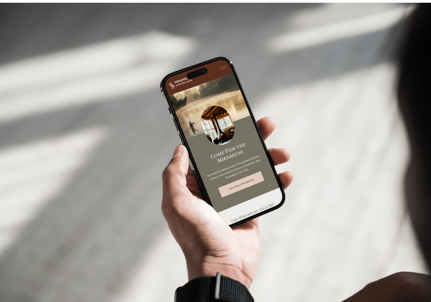
Helping a historic fly fishing club transform its absence online into a refined digital presence—designed to attract a new generation of members while preserving its legacy.
Project Scope
Brand Direction & Identity System • Website Design & Development • UX Architecture • Membership Flow • SEO Foundation
The Real Problem
The Miramichi Anglers Association had no meaningful online presence.
But attracting new members without clearly communicating the experience would have been a missed opportunity.
The challenge wasn’t just visibility—it was perception.
The existing experience:
Relied heavily on word-of-mouth and legacy reputation
Lacked a centralized place to understand the club
Didn’t communicate the value of the experience to new audiences
Offered no clear path for membership inquiries
Failed to connect with a younger generation of anglers
Before driving growth, we needed to define the story—and build a foundation to support it.
From Legacy to Longevity
The Miramichi Anglers Association has been part of the river’s history since 1941.
For decades, the club relied on returning members and word-of-mouth to sustain itself.
As visibility declined and membership slowed, it became clear the experience needed to be translated without losing what made it special.
This wasn’t about reinventing the club or changing what it stood for.
It was about reintroducing it in a way that felt relevant again.
The Strategy
With little initial direction, the strategy had to be defined before anything could be designed.
This meant understanding not just what the club offered, but what made it worth returning to over time.
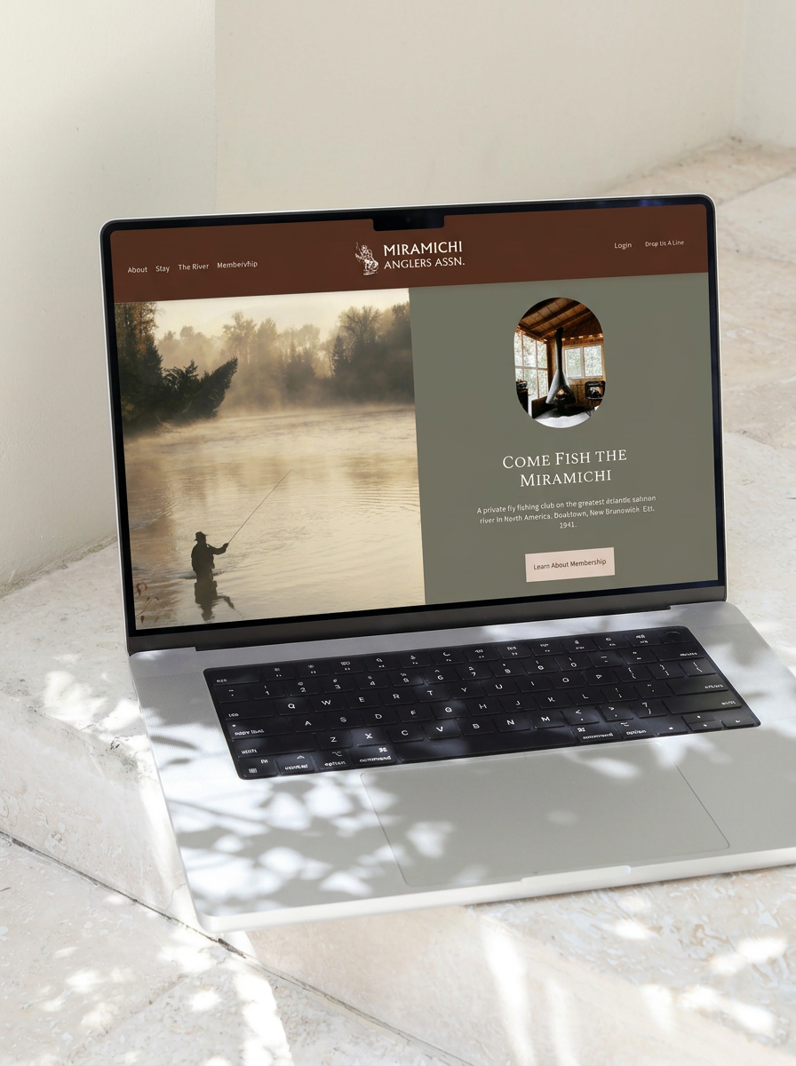
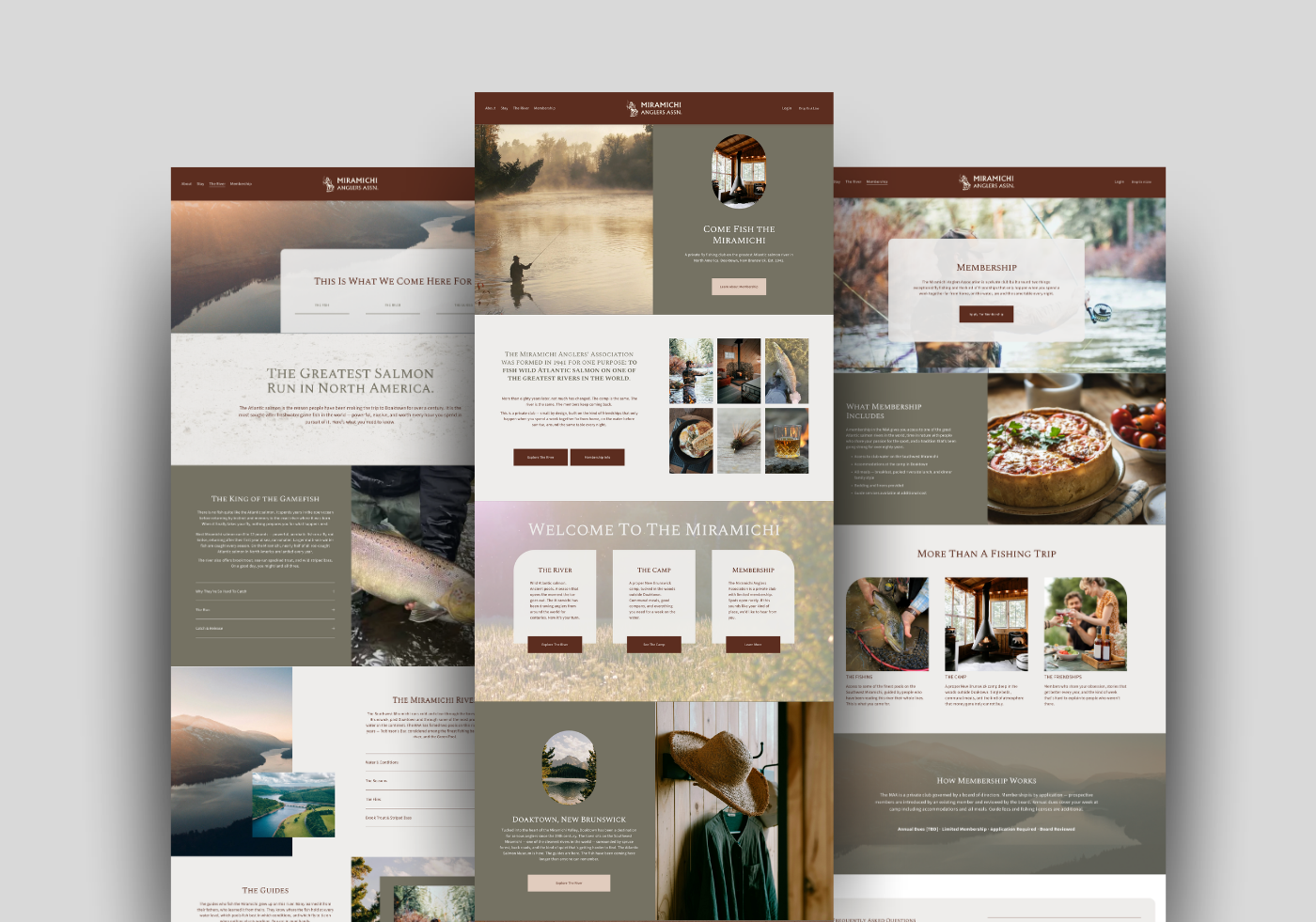
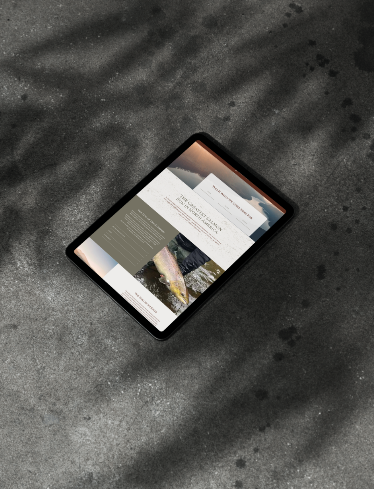
The goal was to create a digital experience that felt immersive, credible, and quietly compelling.
Rather than focusing on amenities, the structure leads with atmosphere, using storytelling and pacing to communicate value.
Content was shaped to guide visitors naturally from discovery to understanding, and ultimately toward inquiry.

Brand Direction
The visual direction was rooted in the environment—rather than built from a traditional brand system.
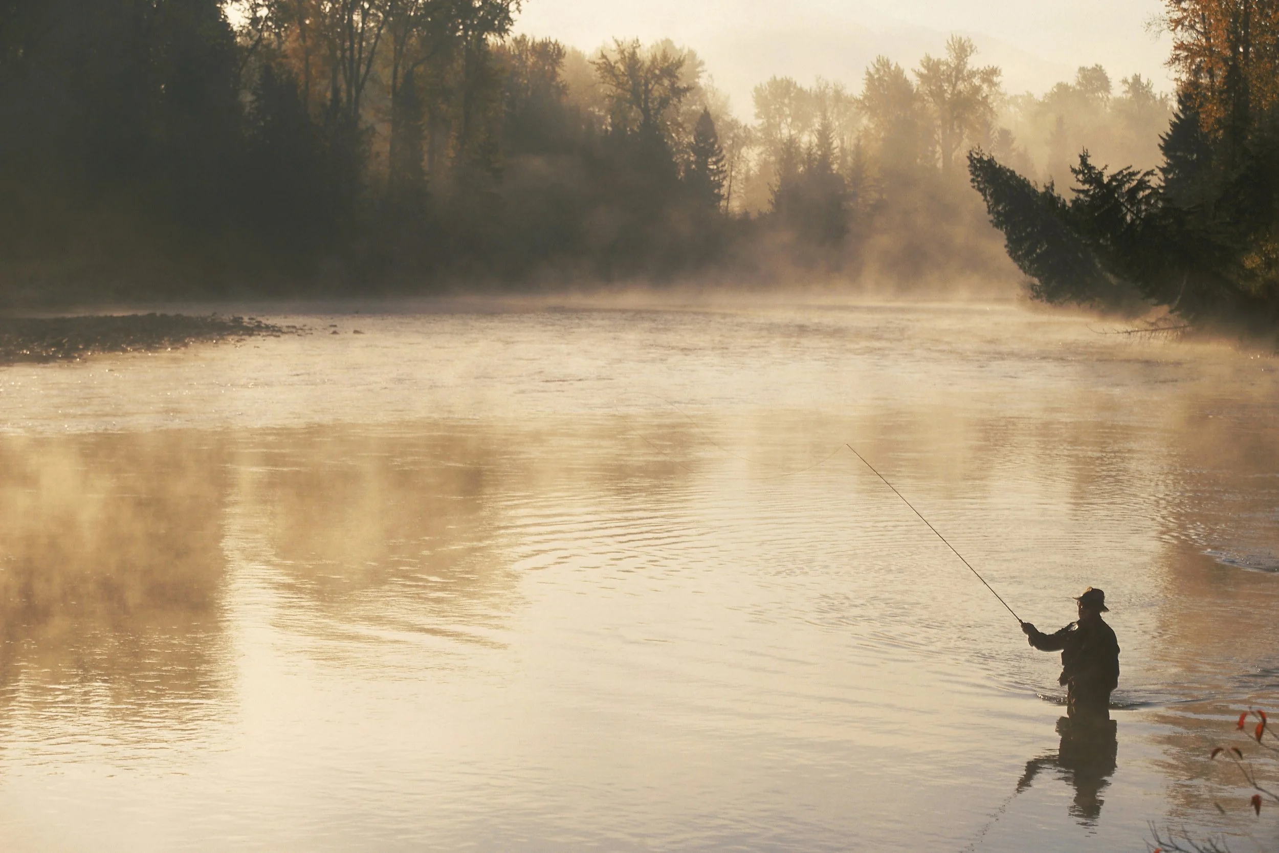
The goal was to capture the feeling of being on the river: quiet, grounded, and immersive.
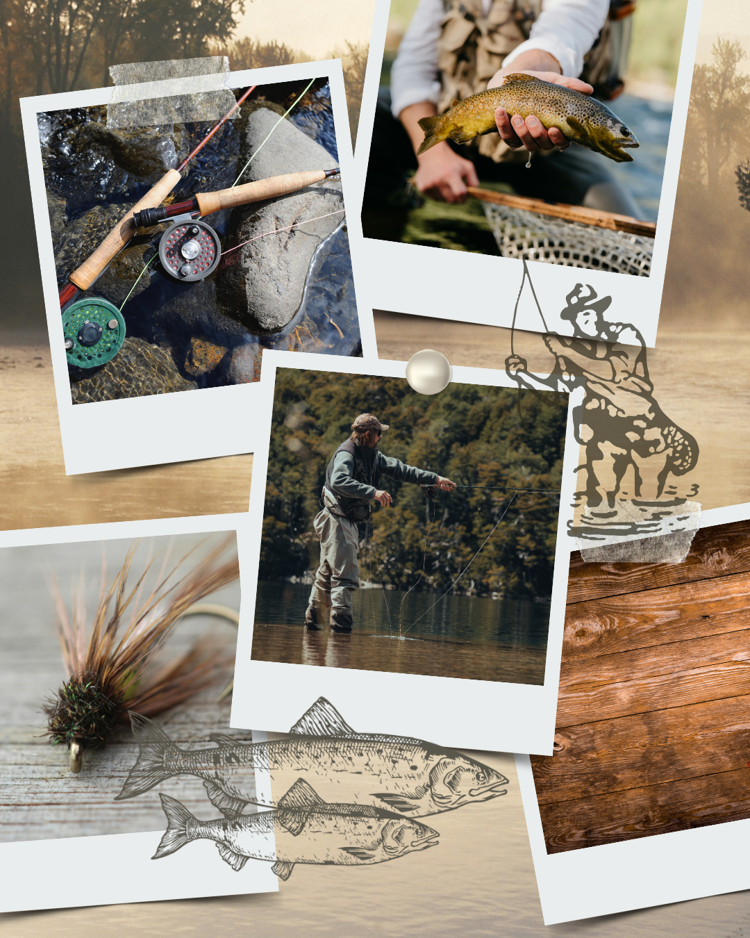
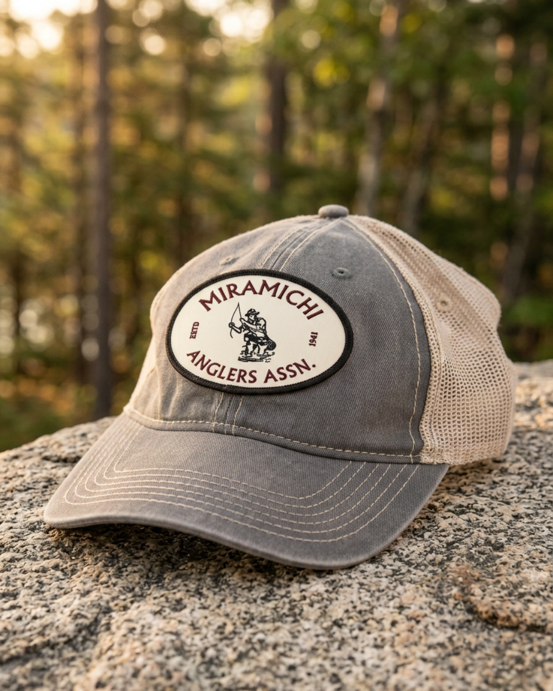
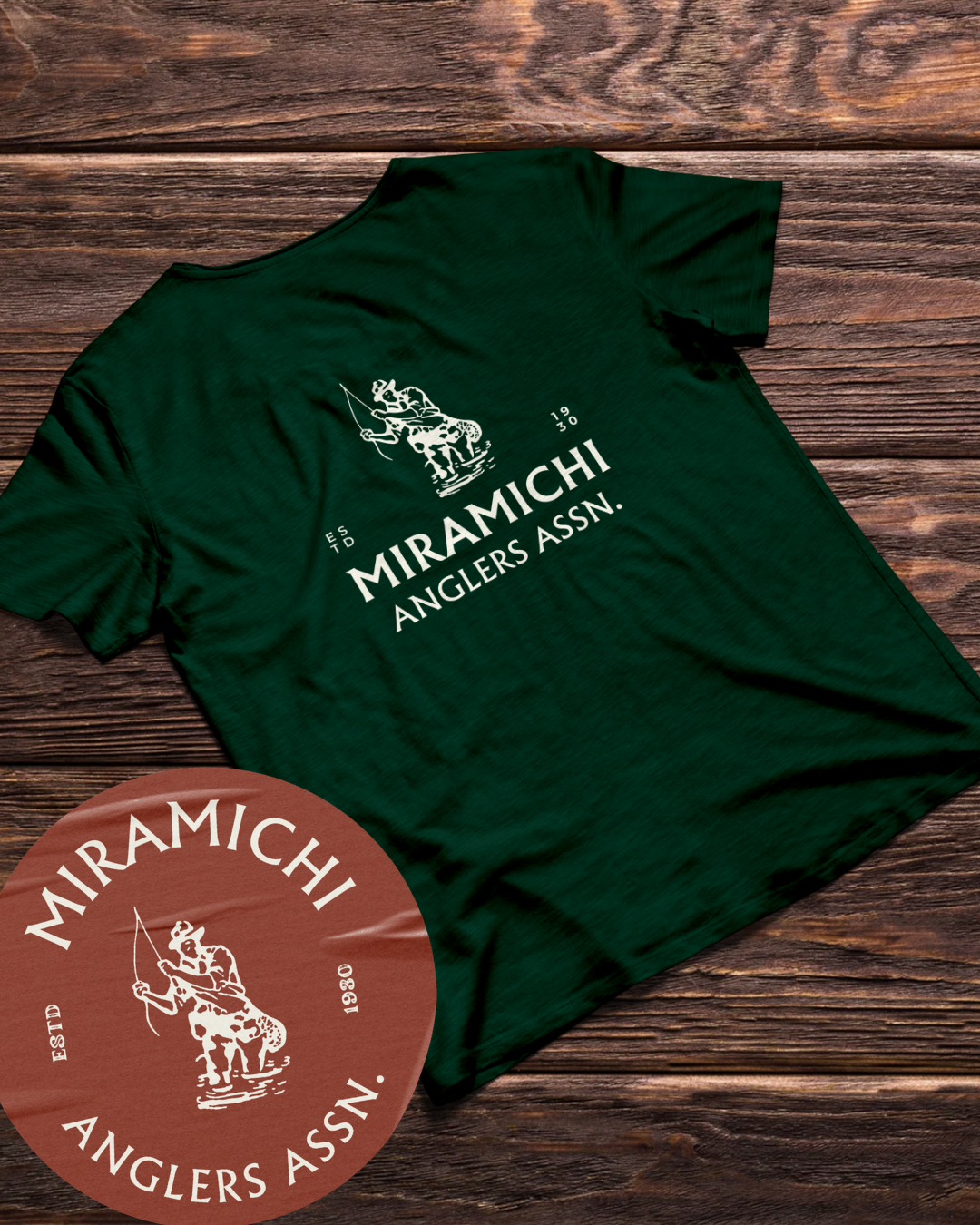
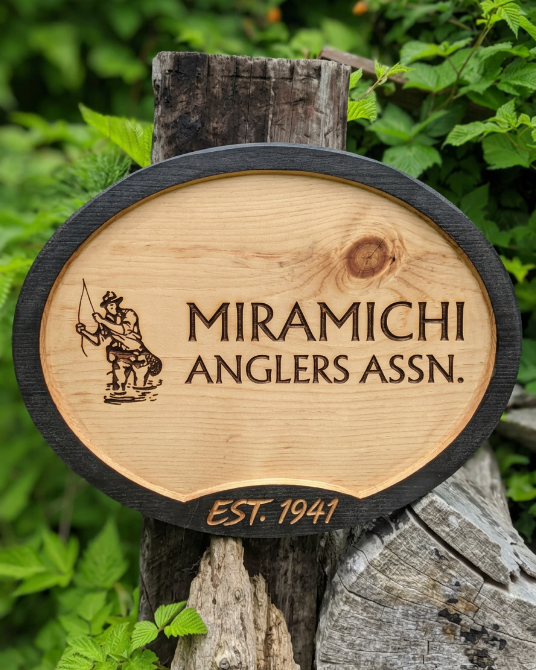
The identity was developed from legacy-inspired angling motifs, reinforcing a sense of history, place, and permanence.
Design decisions were guided by:
Muted, natural tones drawn from the surrounding landscape
Subtle texture and depth inspired by wood, water, and light
Classic, understated typography with a sense of permanence
Photography that emphasized atmosphere over action
The result is a visual language that feels established and intentional—without feeling overly designed.
It reflects the experience as it is: simple, quiet, and deeply connected to place.


“Liz really got what this place is about. The site finally gives the club a presence we’ve been needing for a long time and should help bring some new members in. Honestly pretty impressed with how it all turned out.”
- Jason Grevior, Board Member -
The Outcome
Increased membership inquiries
Stronger first impression for prospective members
Clearer understanding of the club and experience
Improved communication with both new and existing members
The club now has a digital presence that reflects what it actually is—simple, established, and worth being part of.
“We’ve had more people asking about the club lately, which you can’t say we’re used to. The site’s definitely doing its job.”
– Phil Dundas, Board Member