
Rhythm Health & Performance
Nervous system–based chiropractic care for modern families in Santa Cruz, CA
Transforming a growing practice into a brand and digital experience that actually reflects the work—designed to connect instantly, attract the right audience, and feel nothing like traditional chiropractic care.
Project Scope
Brand Strategy • Visual Identity • Website Design & Development • Copywriting • Experience Integration
The Real Problem
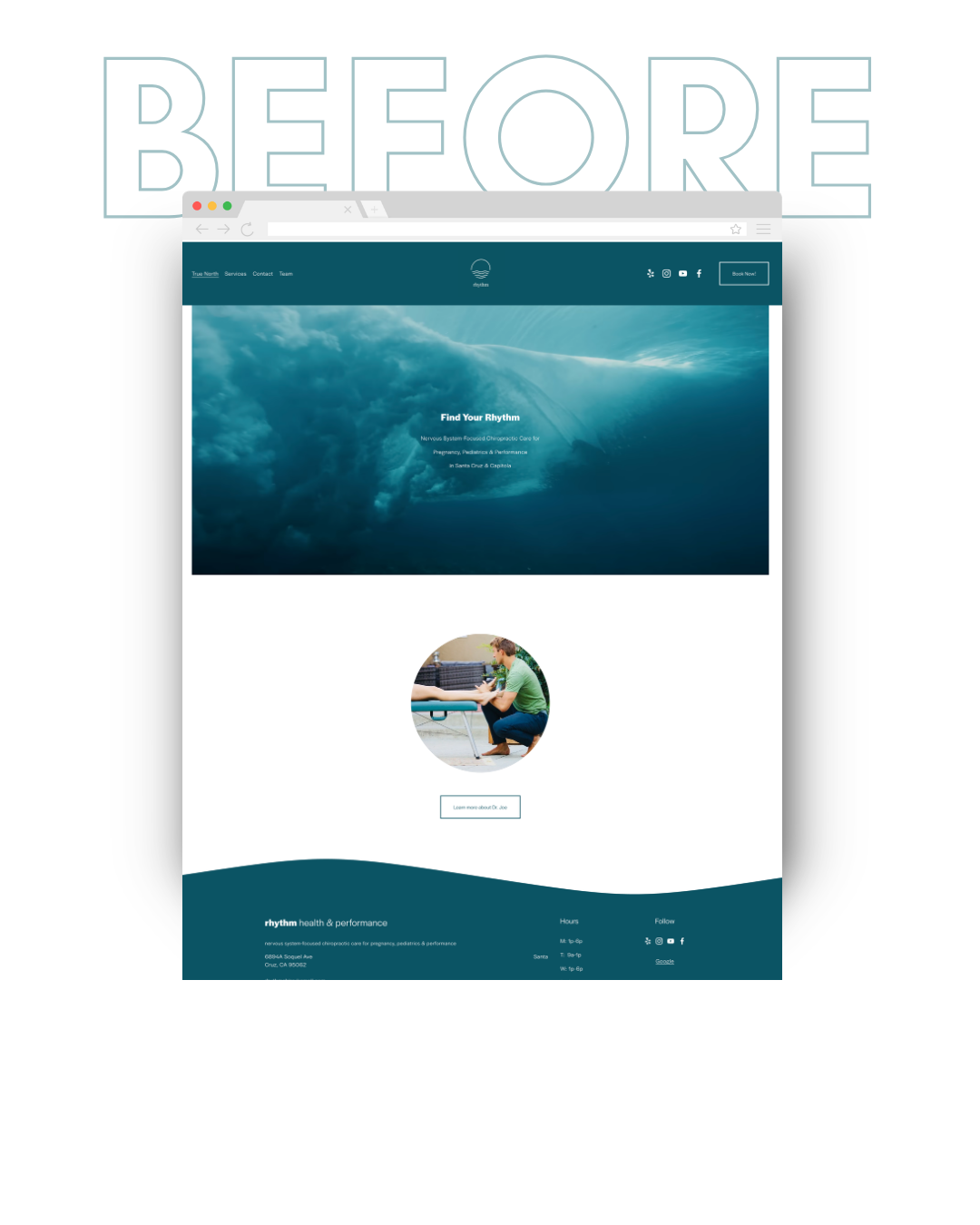
Rhythm had built a strong reputation—but its brand and website told a completely different story.
It blended in with other chiropractic practices—making it harder to see what actually made Dr. Joe different.
This wasn’t a visibility issue.
It was a perception problem.
The existing experience:
• Relied heavily on word-of-mouth and referrals
• Felt generic and indistinguishable from other local practices
• Didn’t clearly communicate the depth of care or approach
• Lacked a clear, guided path for new patient inquiries
• Didn’t clearly connect with young families and parents-to-be
Before growing the practice, we needed to change how it was seen—and build something that actually supported where it was going.
283%
Increase in Website Traffic
within two months of launch
From Traditional to Intentional
Rhythm was in the middle of a shift.
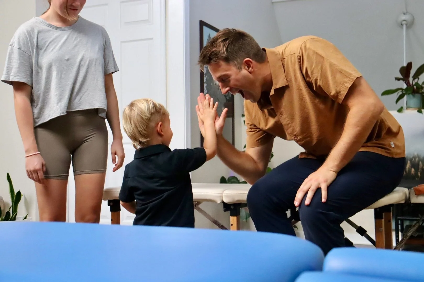
Shifting from a more traditional, symptom-focused model toward a nervous system–based approach centered on long-term health, with a focus on perinatal, pediatric, and family care.
But the brand and website still reflected the old model.
Externally, it felt more transactional—making it harder to see the depth of care behind the work.
This wasn’t just a visibility issue.
It was about supporting a new direction—and making sure the right people could recognize it.
The Strategy
Before designing anything, the focus was clarity.
We needed to define not just what Rhythm was becoming—but how to communicate that shift in a way people could immediately understand.
The direction centered on a few key shifts:
• From symptom-based messaging to nervous system education
• From broad, general audiences to families and parents-to-be
• From transactional interactions to a more guided, trust-building experience
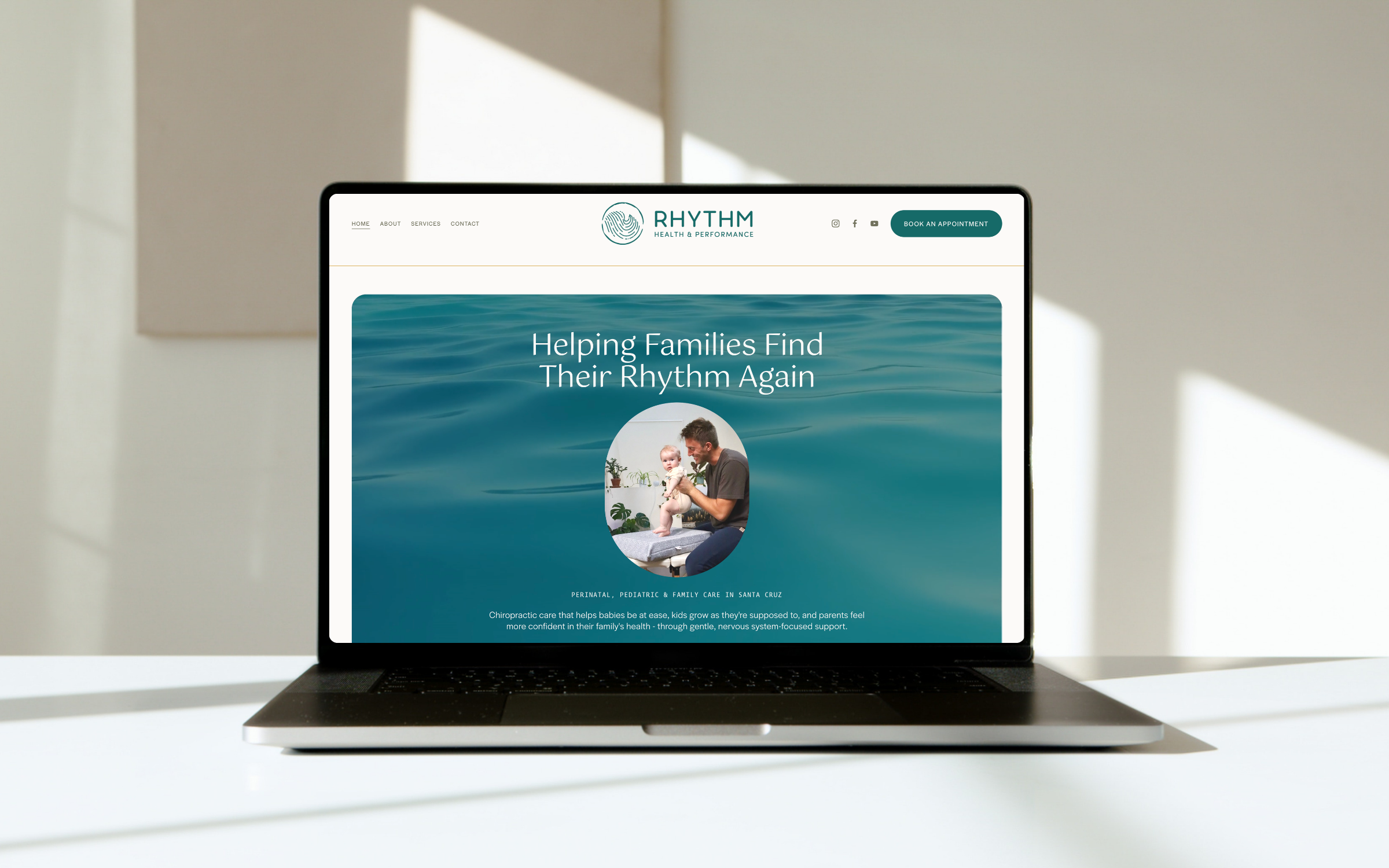
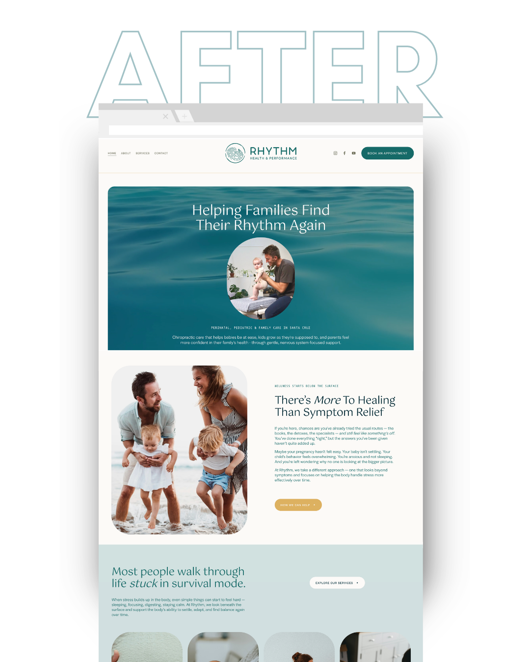
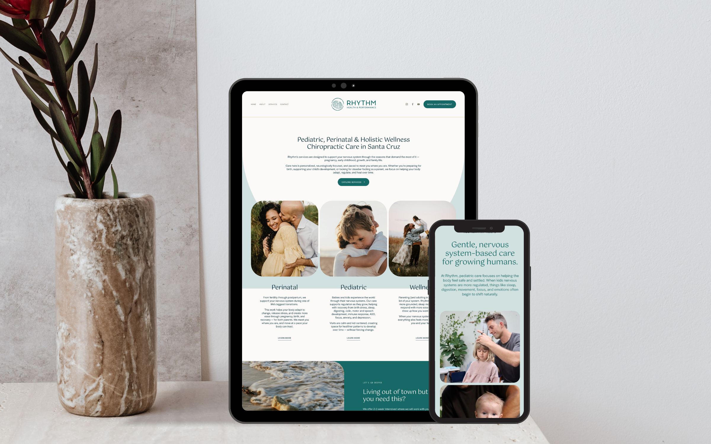
The goal was to create a brand and digital presence that felt calm, grounded, and intentional—while clearly signaling a new standard of care.
Brand Direction
The visual direction was rooted in the philosophy behind the work—not traditional healthcare branding or cliches of beach town businesses.
The goal was to create something calm, human, and grounded—moving away from the clinical, transactional feel most chiropractic brands fall into.
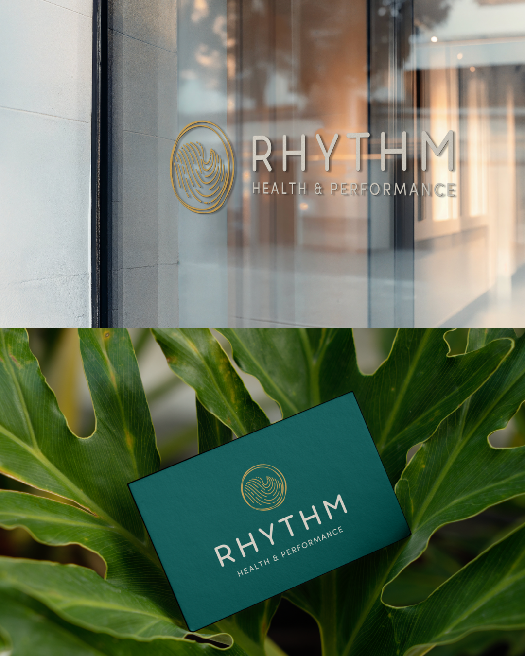
The identity draws from natural patterns and rhythm, reflecting the body’s ability to adapt, regulate, and heal over time.
Design decisions were guided by:
A color palette that sits between blue and green—avoiding industry norms while still feeling calm and trustworthy
Soft, rounded typography that feels approachable without becoming overly playful
A logo inspired by fingerprints and tree rings—symbolizing individuality, growth, and natural rhythm
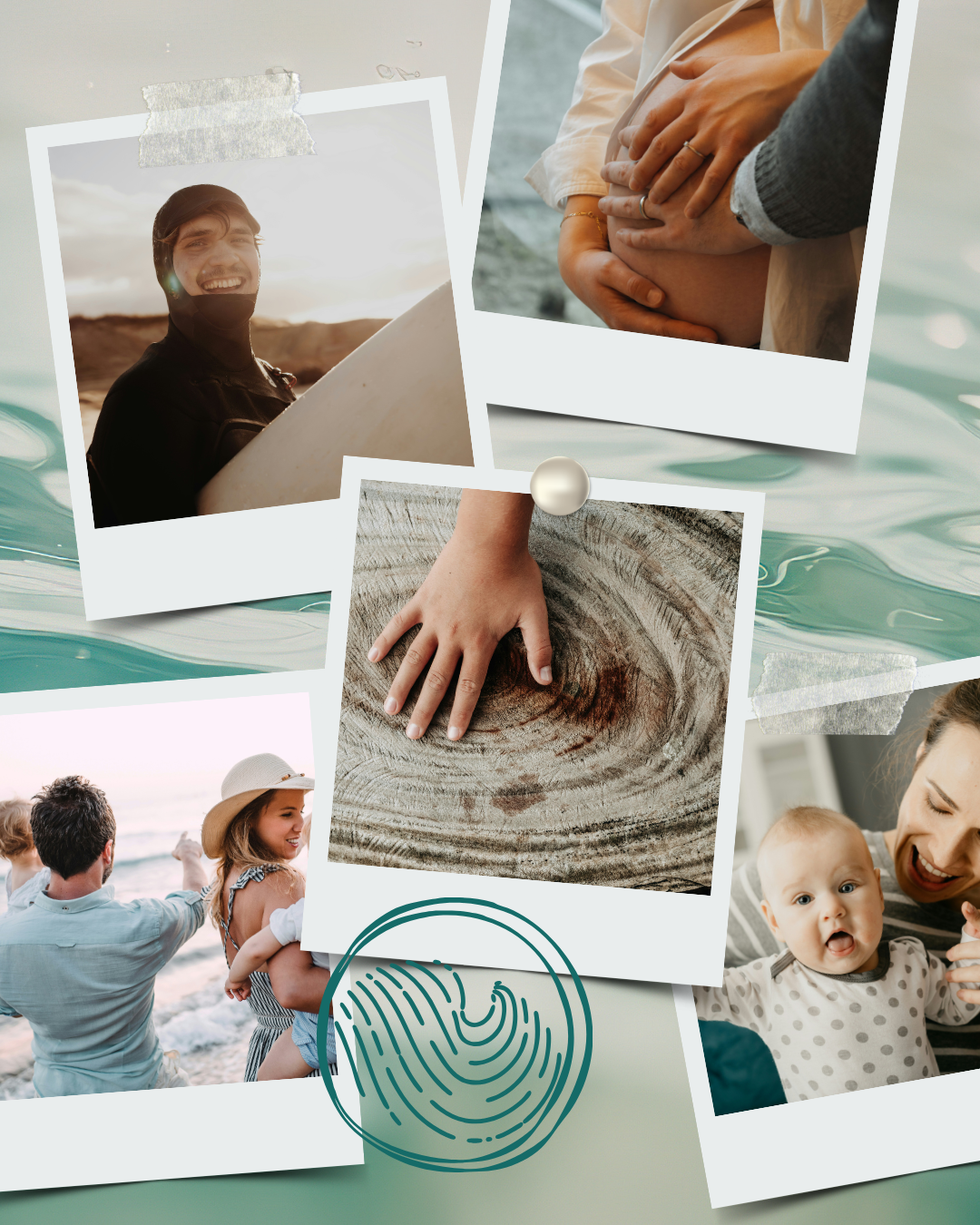
Photography centered on real moments and connection
The result is a visual language that feels intentional—and clearly different from what people expect.

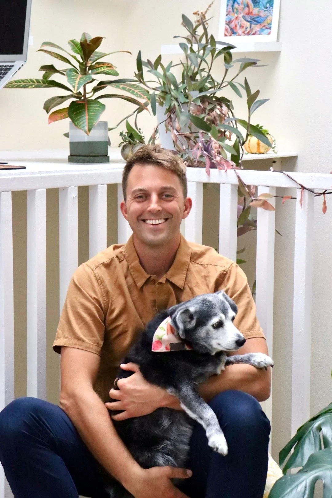
“I feel like Liz literally stepped in my shoes and created what I wanted in terms of a website and brand presence. From a very intentional ‘intake form’ for getting things started to checking in with every update, Liz is a great business partner. Every time I go to my own website, I’m reminded of how gifted she is with putting it all together. PLUS I’m already seeing results from the work she has done.”
- Dr. Joe Thompson -
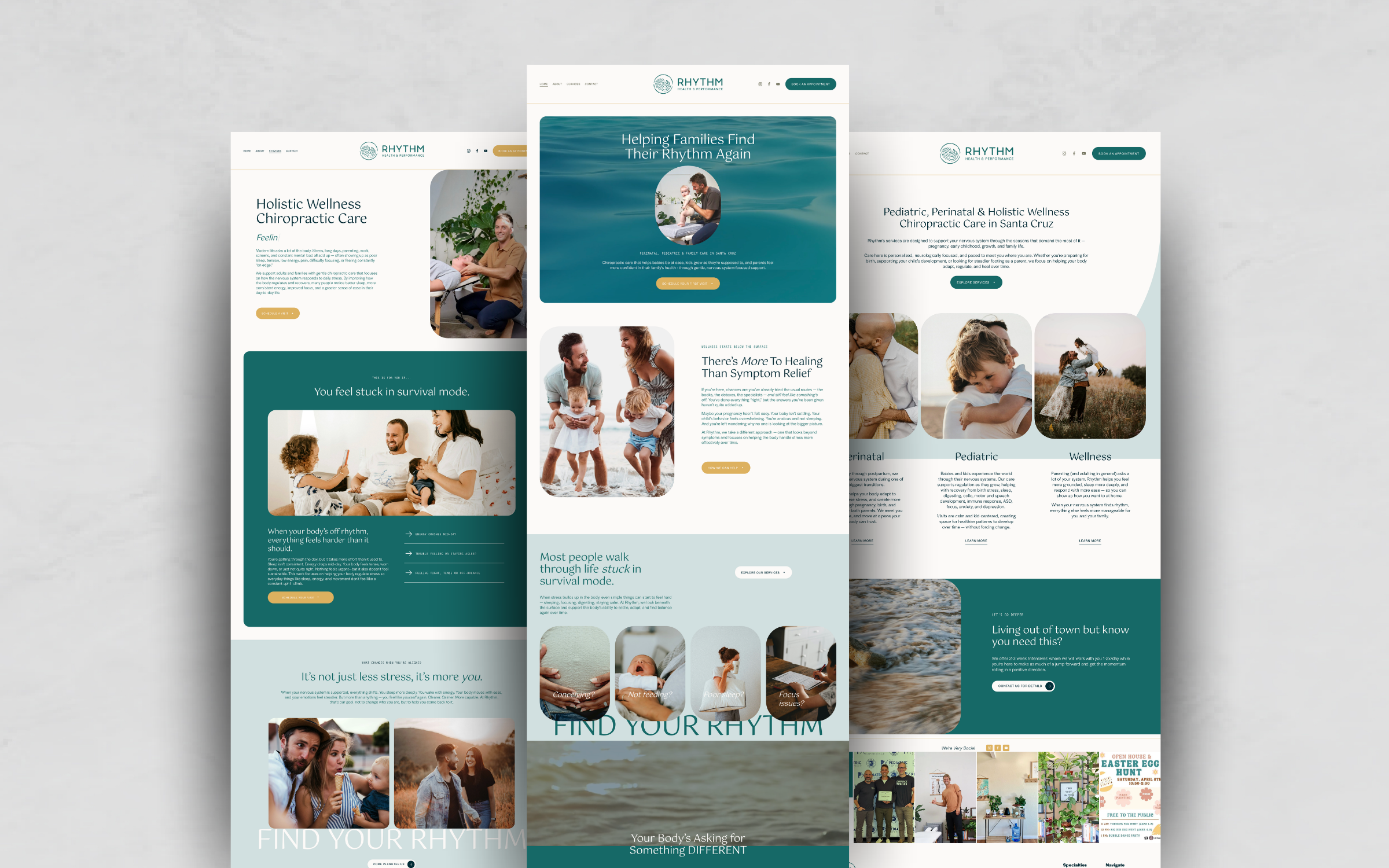
The Outcome
A first impression that immediately signals this isn’t traditional chiropractic care
Clearer connection with families and parents-to-be
A brand and website that reflects the depth and intention behind the work
A seamless experience from first visit to booking
A 283% increase in website traffic within two months of launch
Rhythm now shows up as what it actually is—intentional, differentiated, and built to attract the right people.