Why Most Coaching Websites Fail to Build Trust (And What This Website Did Differently)
Most coaching and personal brand websites don’t actually feel trustworthy. They feel performative.
Everything sounds polished. Everyone talks about “transformation.” The messaging is vague, overly self-focused, or trying so hard to sound elevated that you leave the site with no real sense of what the person actually does.
A lot of wellness brands end up making the same mistake: they build websites around themselves instead of the person searching for help.
That matters more than people realize.
Because when someone lands on a coaching or health and wellness website, they’re usually not casually browsing. They’re overwhelmed, burned out, grieving, stuck, anxious, trying to change something, or quietly falling apart in ways the people around them may not even see yet.
They’re asking:
Can this person actually help me?
Do they understand what this feels like?
Can I trust them with the version of myself I don’t show publicly?
Most websites never answer those questions clearly enough.
That was part of the challenge with Kimberly Katherine’s brand.
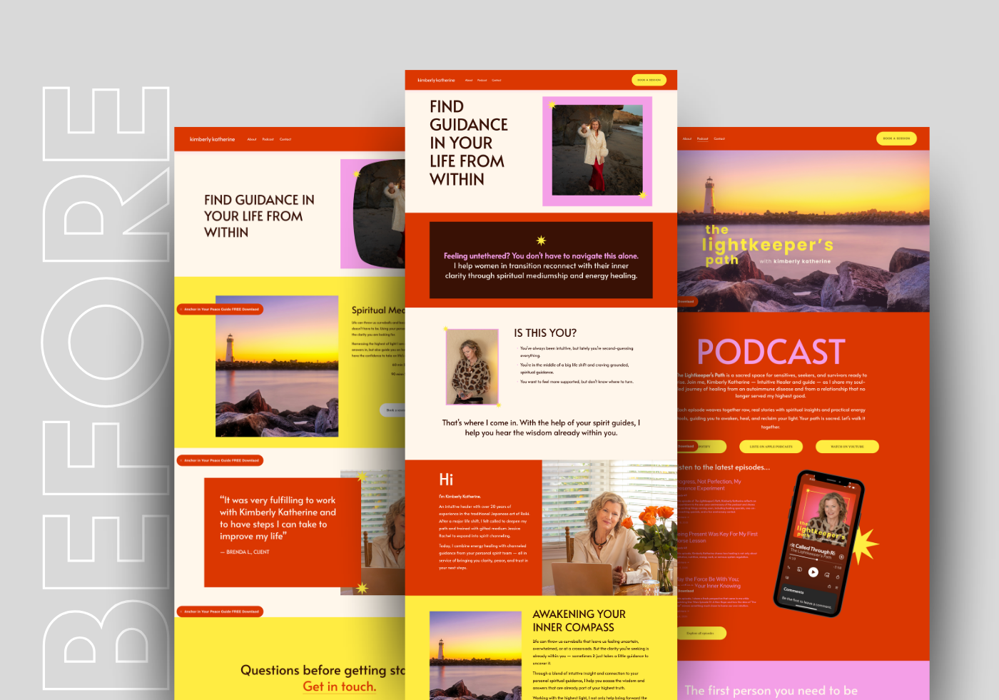
Not because the work lacked depth. It didn’t. Kimberly already had a strong audience, a clear voice, professional photography, a growing podcast, and years of experience behind her work. The issue was that the digital experience had no strategy behind it and wasn’t designed or written to meet her audience where they were and guide them to where they want to be in their lives.
By the time we started, the brand had personality, but not enough structure underneath it.
The Problem With Most Wellness and Coaching Websites
A lot of coaching websites either go extremely clinical or extremely spiritual. There’s weirdly not much in between.
Some feel cold and corporate. Others feel so abstract you still don’t know what the person offers after scrolling for five minutes.
And honestly, a lot of them spend too much time talking about themselves.
Their healing journey.
Their philosophy.
Their certifications.
Their story.
Meanwhile the visitor is sitting there wondering: Okay, but where do I fit into this?
That disconnect matters.
Especially in industries built around emotional trust, the website has to make people feel seen quickly. Not manipulated. Not sold to. Just understood.
That doesn’t happen through prettier branding alone. It happens through positioning, messaging, pacing, structure, hierarchy, and knowing what someone actually needs to hear when they arrive.
Kimberly’s audience wasn’t looking for another polished “high vibe” wellness brand. A lot of the women finding her are navigating grief, illness, divorce, burnout, identity shifts, nervous system dysregulation, or periods where life stopped feeling recognizable.
The website needed to meet them there without feeling heavy, chaotic, or emotionally overwhelming.
That balance became the entire strategy.

The Strategy Behind the Redesign
The goal was never to strip personality out of the brand.
Honestly, that would have ruined it.
Kimberly’s work is emotional. Expressive. Human. The color, symbolism, layered visuals, podcast content, and storytelling were all part of what made the brand memorable in the first place.
The issue was that everything carried the same visual weight all at once.
Nothing guided people.
Nothing slowed them down.
There wasn’t enough structure holding the experience together.
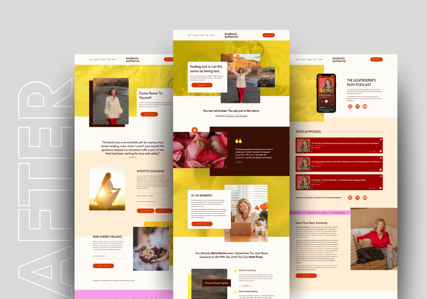
So instead of flattening the brand into another muted beige wellness site, we focused on creating clearer hierarchy and stronger user flow while protecting the emotional energy that already existed.
That included:
restructuring navigation and service pathways
clarifying distinctions between coaching, Reiki, podcast content, and longer-term work
improving mobile responsiveness and readability
integrating lead generation and email marketing more intentionally
strengthening SEO structure and foundational trust signals
refining messaging around the actual transformation clients are looking for
A lot of people think redesigns are mostly visual.
They’re usually structural problems wearing visual disguises.
Why Emotional Brands Still Need Clarity
One thing I strongly believe: emotional storytelling without clarity stops converting fast.
You can have beautiful visuals. Deep writing. A compelling personal story. But if visitors can’t quickly understand:
who the site is for
what problem is being solved
what makes the approach different
or where they should go next
they leave.
Not because the business isn’t valuable. Because confusion creates hesitation.
And hesitation kills conversions.
That became a huge part of this website redesign. Every page was intentionally built to feel more guided without losing warmth. More grounded without losing personality.
The final site still feels expressive and emotionally immersive, but now there’s actual pacing to the experience. Space to breathe. Space to understand the work. Space for someone to see themselves inside it.
That’s usually what people are actually looking for.
Not perfection.
Recognition.
What Business Owners Can Take From This
If your website no longer reflects the level of your work, it usually isn’t because your business suddenly became bad at what it does.
More often, the business evolved and the website never caught up.
Offers changed.
Positioning sharpened.
Your audience shifted.
Your expertise deepened.
The business matured.
But the site still sounds like an earlier version of you.
I see this constantly with service providers, coaches, wellness brands, and creative businesses that grew organically over time. The website becomes a collection of additions instead of a cohesive experience.
And eventually people feel that disconnect, even if they can’t articulate it directly.
That’s why strategic website design matters.
Not because a prettier website magically changes your business overnight, but because the right structure helps people understand the value of what you already do much faster.
It creates trust.
It reduces friction.
It helps the right people move forward.
Final Thoughts
Kimberly’s new site now works as a connected ecosystem instead of a collection of disconnected pages. The podcast, services, blog, booking flow, lead generation, messaging, and visual identity finally support each other instead of competing for attention.
More importantly, the brand now feels aligned with the actual depth of the work behind it.
That’s the part that matters most.
If your business has evolved but your website still feels unclear, disconnected, outdated, or strangely difficult to explain, the answer may not be starting over completely.
You may just need stronger strategy underneath what already exists.